
Nike UI
This wireframe design is a remake of the current Nike store app that is out right now. My main foresight for this project was to implement a minimal approach to the athletic shopping experience. This app holds the categories, product list and info, as well as a checkout screen. Technologies used: Sketch, Adobe Photoshop CC

This is personal project that I decided to personally take on, where I had asked around a few people for an app that needed a few visual changes. And through the surveys, I decided to focus on fashion and lifestyle. After individually brainstorming and researching current events in the retail landscape, I determined that there was a great opportunity within the athletic wear industry.
In further researching the athletic wear industry, we collectively chose to analyze Nike, Inc. — as they are one of the most reputable and largest athletic wear companies in the industry and world.
What is this?
Nike's Outlook
“Bring inspiration and innovation to every athlete* in the world. *If you have a body, you are an athlete.”
With Nike’s mission in mind, I was very inspired to develop an innovative app that would help encourage more users to feel like they’re part of the Nike fitness community.
The Problem
New athletes who are looking to live a more active lifestyle, need assistance in choosing the appropriate attire to match their exercise needs.
The Opportunities
Nike is one of the largest brands in the industry and the world. With an overwhelming amount of merchandise, there is an opportunity to help curate proper attire, accessories and gear to specific target audience members. The brand fosters a culture of invention and strives to build deep personal connections with consumers. Nike does this by delivering an integrated marketplace with compelling retail experiences.
Main Objective
The primary goal is to build deep, personal connections with consumers. In order to do so, we strive to deliver an integrated marketplace with compelling retail experiences. I wanted to design a mobile app that will assist in enhancing a user’s in-store experience.
Potential Key Performance Indicators (KPI’s)
- Increase in-store revenue generation versus e-commerce business
- Encourage consumer buy-in to Nike fitness community
- Foster brand loyalty
The Approach
Research at a Glance
Nike currently has a few apps, we took a look at SNKRS and Nike Tech Book — both were designed to help shoppers outside of the store via look-books, release dates etc. We found that every Nike app was linked through a customer’s Nike+ account, so we kept that in mind while designing.
I began the initial research by downloading various athletic wear company apps on our phones. We analyzed a number of Nike’s competitors and other comparative brands to understand what features are currently available and what we could implement to create opportunity.

Mission Statement, taken from about.nike.com
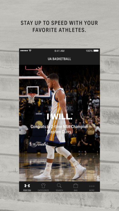
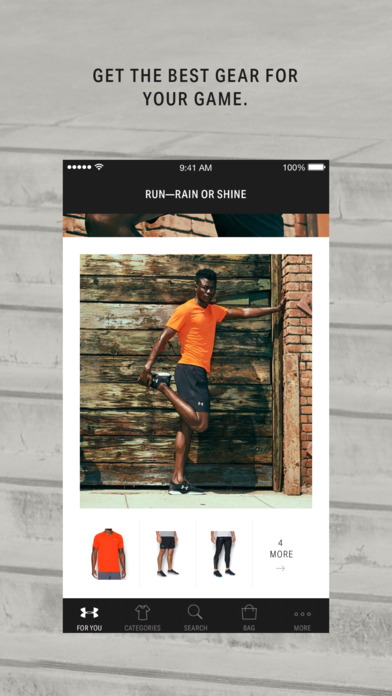
I took a look at Under Armour's website and found that they had a “For You” tab and an “inspiration” section that featured athletes and their stories and suggestions. Many large athletic wear companies did not offer an e-commerce app, but apps that help promote and encourage healthier lifestyles and workouts. Comparative brands that were analyzed offered very interesting features that we wanted to consider for our app.
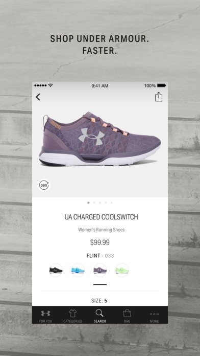
Taken from the iOS App Store
What makes a design great?
1. Infusing Your Brand Design
Your app should aim for instant recognition rather than to show off multiple designs. It should be ‘Ah! I know this brand’ kind of feeling.
Keep the app consistent with your brand whether you are getting the app designed or you are doing it yourself. How?
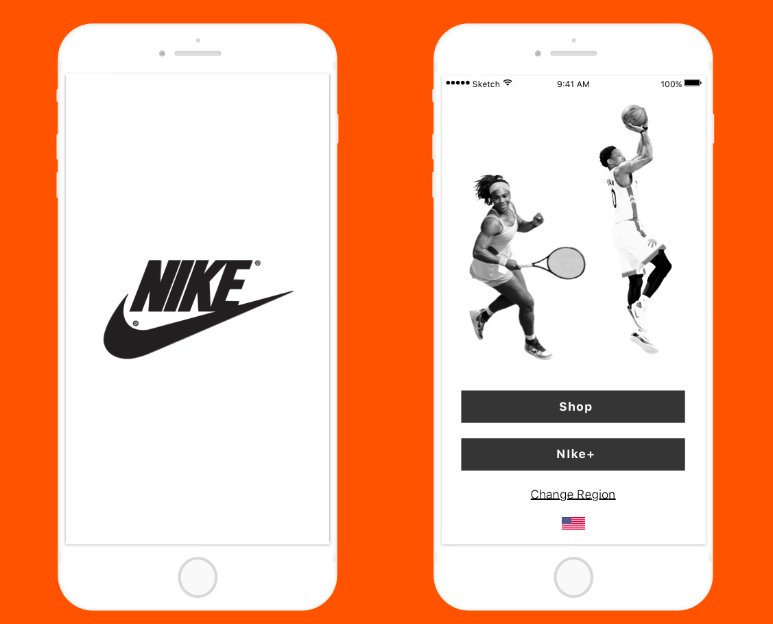
– The first screen that the user sees on opening your app should be your brand name and tagline.
– It should be neat, with a minimalistic design.
– Base your app’s design on this philosophy
This ensures that your app falls in line with the design elements, the buttons, the links that you provide are coherent with the web layout. For example, an eCommerce website selling clothes will look good with material design whereas that of an a game app will use more color and funky names for the levels.
Straightforward design
2. Clarity precedes Design
What is your key feature? It should be clear to the user, that easily lets him understand what they can do and what they can’t. You do not want to leave your user confused.
The menus and related options should be simple and easy to understand even for a first-time user. For example, if you have multiple icons with different functions, you should make their functions clear.
Once you are clear on what you need to do, you will be able to add brevity to your app. Here are some points you need to be brief about-
– Terms & Conditions
– Usage
When it comes to showcasing your features, your user should feel compensated by the tangible or intangible value that has been added by the app.
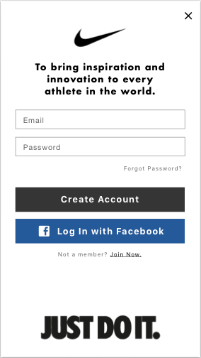
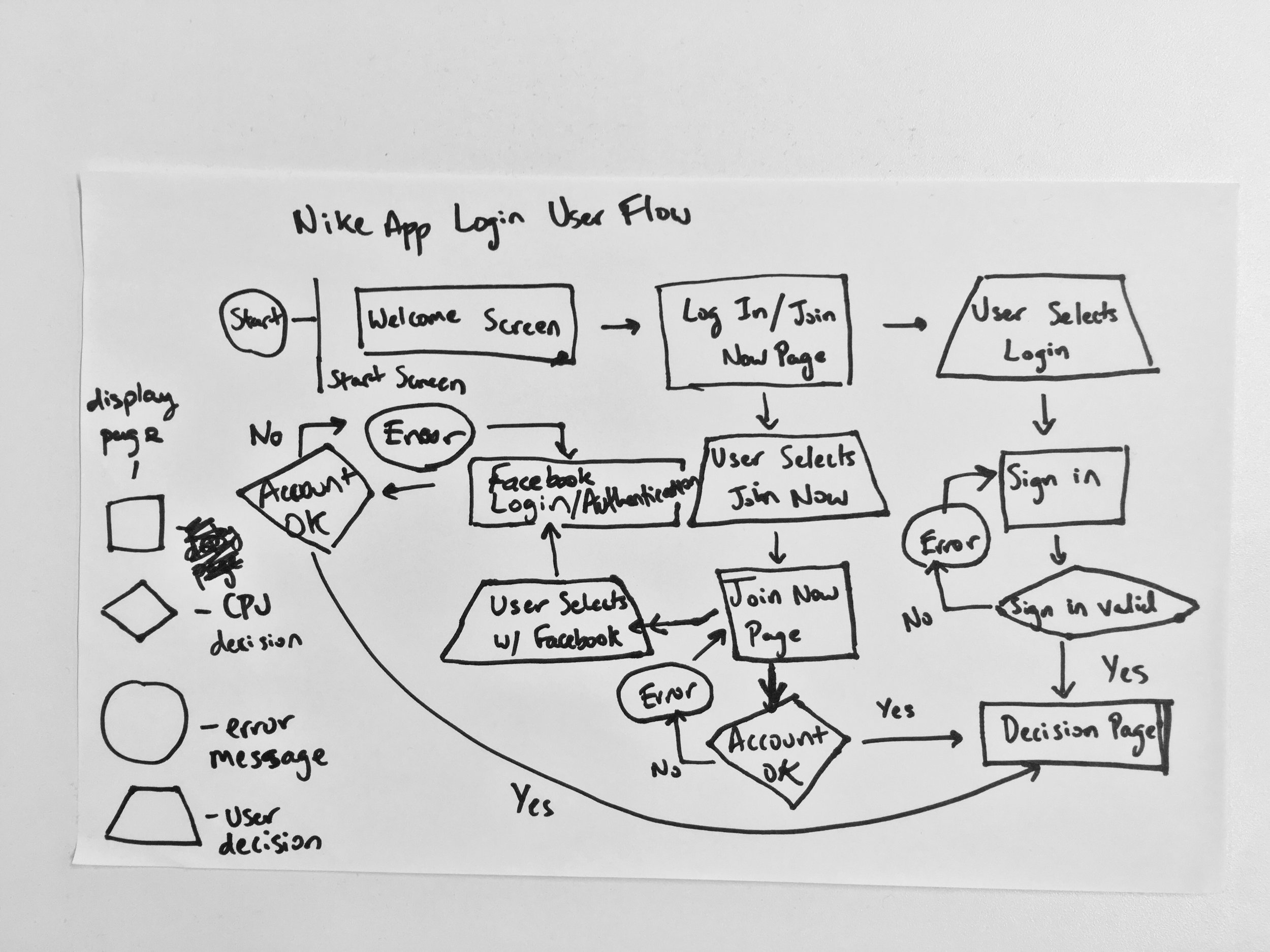
Login
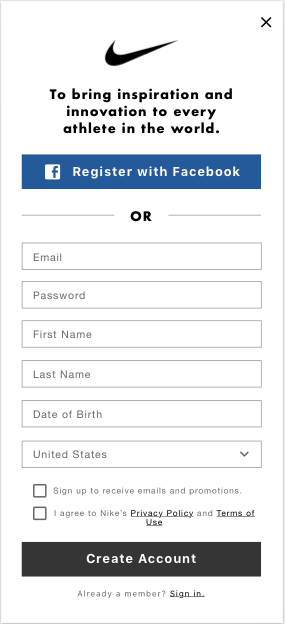
Join Now
3. A/B Testing- The God Of All Things Successful
How do you know what works for you and what doesn’t? A cool app is only ‘cool’ when you have A/B tested and designed one that is well-liked by the users.
Before launch, you need to test on a bunch of real devices because what works on paper may not do so in practice.
Easy tip to A/B test your app:
– Before you launch your app, have your team interact with the app for 3–7 days.
– Observe which options work best, which buttons are redundant or necessary, which elements are working, which animations are better suited etc.
According to Peter Tanham, co-founder of SparkPage, in his article ‘How to Increase Your Mobile App Sales With A/B Testing’, you should do “Micro Testing”- a method that lets you test marketing elements like your icon, price, description etc… Then you can apply your findings to the app store.
How to create your first micro test in 3 steps:
1. Create an A/B Landing Page
2. Send Traffic to Test Your Pages
3. Analyze Your Results
Usability testing is a must no matter how good you think your app looks or is designed. Just don’t expect people to look at the app the same way you do.
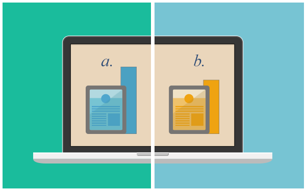
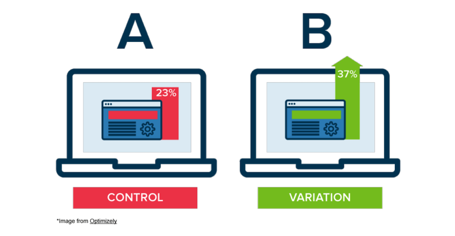
A/B testing, from Optimizely.com
4. Know your audience
Ask yourself — who is my audience? Identifying your audience in the initial stages makes it easy to plan the design and functionality around its preferences.
To have a quality audience, your app should make something easier, give valuable information, save money, or entertain.
Some questions you should be asking yourself:
– Are you building a game for a certain demographic?
– Is it for people in a particular country or region, or do you want your app to have global appeal?
User Interviews
In order to narrow down the users we wanted to interview, our first step was to send out a survey. After 45 responses we were able to select 15 interviewees.
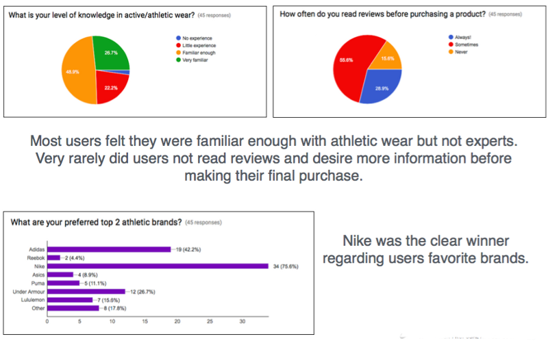
Some of the biggest takeaways were:
- Although our users expressed that they usually perform research on their athletic purchases beforehand, they still need to go into the store to check quality, feel & functionality.
- Most users did not like asking for sales assistance unless it was for a specific product.
- Their main frustrations were store congestion and time spent in store.
App Login User Flow
Keys to acknowledge
A Catalogue or List of Goods
How do users wish to browse your product catalogue? Running A/B testing can reveal how your customers prefer to interact with your store’s app. Here are a few tips we can offer to help you design an effective catalogue:
Hick’s law says that every additional choice increases the time required to make a decision. Paring down the number of items in your menus can have a direct influence on conversion rates, since users will not feel overwhelmed by too many options. Organize all menu elements according to the principle of visual hierarchy.
The principle of visual hierarchy says that by using color, contrast, texture, shape, position, and size, you can organize elements on a page so that users instantly understand which object is the most important.
- Increase the size of select items, and display them one at a time.
In ecommerce, fewer is often better. Our attention spans are limited, and we cannot adequately take in a huge grid of items simultaneously. A study about ecommerce conducted by Visual Website Optimizer showed that increasing the size of product images can increase conversion rates by as much as 10%.
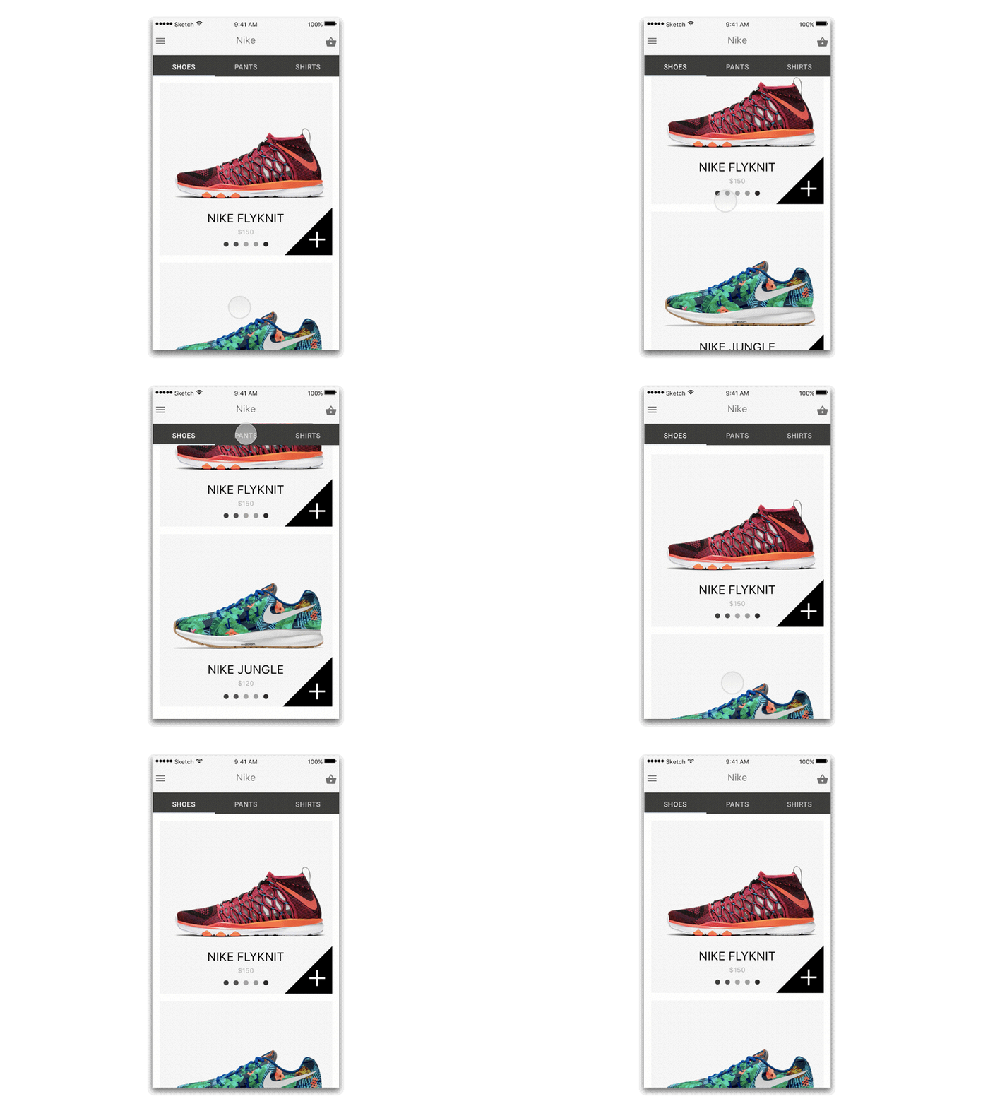
Product list
Filters
In fashion/style apps, as well as in ecommerce apps, there are generally two types of filters. One is very broad ( for example, men’s/women’s/kids’), the other much more specific. The crucial question is not whether filters are important, but rather how to arrange filters in an optimal way to increase sales.
Research shows that the price button is arguably the most “clickable” among all filter buttons: if you were to look at your app screen using heat maps, the price button would be bright. Price is followed in order of significance by size, color, and materials.
In the example below, color, size, and price are shown in a line and given equal visual emphasis. Such a filter is simple to use.
Shopping Cart or Checkout
There are four steps that characterize the final stages of any shopping experience: adding items to a cart, reviewing the cart, choosing a payment option, and processing payment.
Therefore, the next logical step after filtering search results is to move a user’s attention to the “Add to Cart” button. Making “Add to the Cart” stand out against the background of your app and stand out from other buttons is essential. You can accomplish this in several ways: by focusing on the button’s size, color, transparency, or position on the page.
In our design below we chose a green button against a white background. A white background is often the best choice for ecommerce apps, as it prevents your app from becoming too cluttered with shapes and colors. Additionally, a white background does not distort any color displayed against it. Green is subconsciously associated with positive emotions and approval, and so we selected a green “Add to Cart” button to motivate our customers.
Placing the “Add to Cart” button in the middle of the screen can also be a wise choice considering that around 20% of your users will be left-handed. Placing the button in the center makes it equally convenient to reach for both right-handed and left-handed customers.
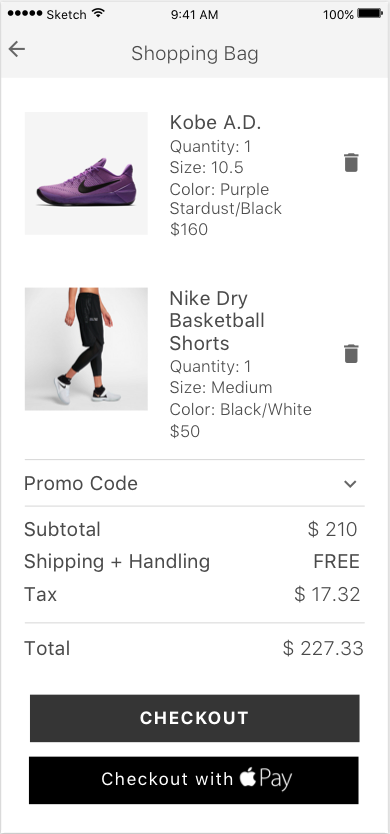
Shopping Bag
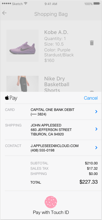
Checkout with Apple Pay
Checkout
Customers expect multiple payment options. They also expect a quick and secure checkout. The animation above assumes that a customer will pay for their goods with Apple Pay.
Why Apple Pay and not some more traditional payment options? One reason is because Apple Pay requires fewer steps for a customer to complete the purchase. Customers don’t need to type in all their credit card information (such as credit card number and expiration date). Paying with Apple Pay requires only choosing a credit card and touching the home button to confirm the transaction with Touch ID.
Why is simplifying the payment process so crucial for mobile ecommerce?
People who shop using their mobile phones don’t want to be burdened by the laborious process of registering a new account. A recent customer behavior study showed that 14 percent of users didn’t want to create an account with an online shop and 11 percent don’t want to share much personal information. The long and the short of it is that if you require your customers to register their credit card information or leave their email before they can even add an item to the cart, your conversion rate will be disastrous.
What important tips about mobile ecommerce design should you take home?
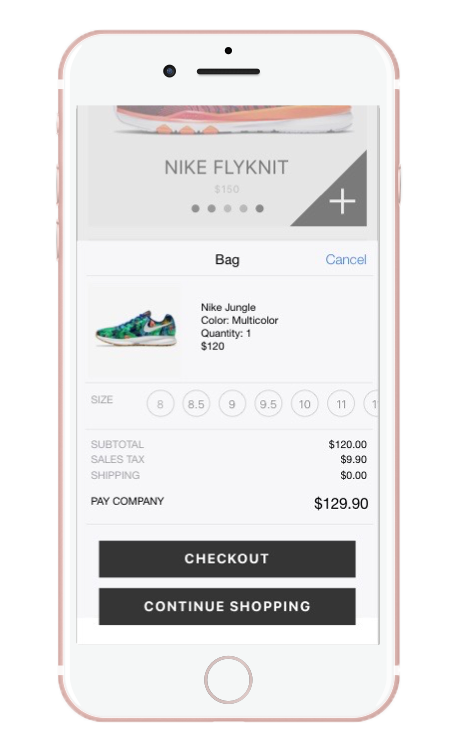
Quick look at your shopping bag
- Simplify your menus.
- Opt for fewer images of a larger size.
- Carefully consider which filters are most critical for your products, and then make them stand out.
- Use visual hierarchy to make your Add to Cart button impossible to miss.
- Determine the most convenient payment options for your customers (run a\b testing if you are not sure).
- Use bold notifications or an animation to indicate that the order is being processed. People want to know at every instance that your app has not crashed and that something is happening — especially when their payment is being processed.
Designing ecommerce or fashion apps is all about turning online shopping into the joyful experience that real shopping can be in a high-end shop. Make the shopping experience fun for your customers! Being limited by the size of mobile screens, designers have to think hard to make the user interface of shopping apps simple, intuitive and visually appealing.
Nike+ Integration
Fitness activity tracking apps
This category includes apps that track physical activity including steps taken, stairs climbed, sleep hours, sleep quality, distance traveled and calories burned.
To implement activity tracking capabilities you don’t even need to connect your app to a smartphone’s sensors. HealthKit and Google Fit both offer APIs to access health and fitness data collected on their platforms. If you want your app to constantly detect and monitor pulse, blood glucose level, and other physiological parameters that are hard to get from a smartphone you can implement a Bluetooth connection to enable data flow from a fitness tracking device.
Workout apps
There are a few flavors of workout apps. We will break them down into three broad categories: personal trainer apps, logbook apps, and a workout fitness tracking apps that pair with devices people wear to the gym.
Personal trainer apps include pre-arranged exercise routines that can come in different formats: video, illustrations, 3D models, or just text. You can choose a workout that matches your personal preferences, set up a level of difficulty, and start training muscles from the comfort of your home. No gym required.
Assessing the current app
I was first introduced to Nike+ Training Club after seeing several fitness trainers recommend this app while I was scrolling through posts on Instagram. Intrigued, I downloaded the app and found I really enjoyed using it for circuit workouts.
Taken from akqa.com
Nike has seamlessly integrated dynamic photography with bold type to create a truly motivating visual hierarchy. Users can quickly identify the workout type, as well as the athlete who will be leading it. Nike has even mixed in motivational quotes from famous athletes that sponsor workouts on the app. The design is clean, fresh, and gets straight to the point. It accomplishes everything I would expect from a mobile exercise platform.
Besides just listing out options, the microcopy under each option provides more context and relevance to the user. To be unbiased, I have tried other fitness apps as well but I keep finding myself going back to Nike+ app every time I want to do an at-home workout. There are of course improvements Nike+ can explore and introduce but for what it’s worth. So here's what I wanted to integrate.
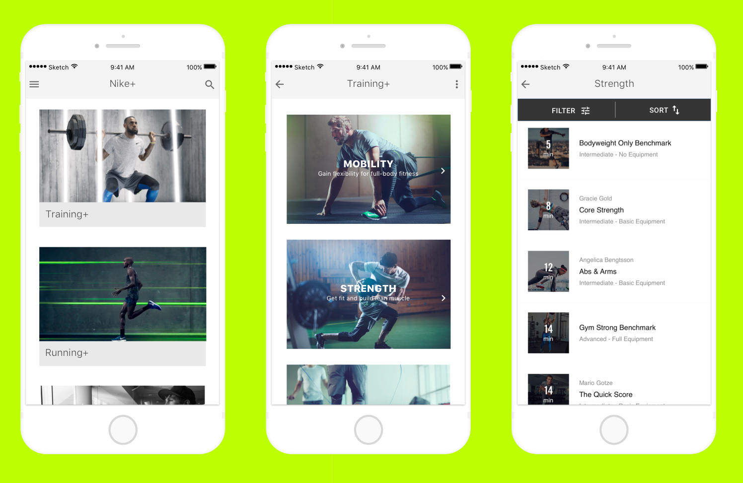
My mockup
Some of the top-rated workout apps were nice, but they relied on downloading high quality audio and video. This made it hard to work out while on the go when I didn’t have strong cell reception or access to Wi-Fi. I needed an app that was offline-first and quick to sync content.
In addition to improved UI and UX, the best upgrade to the app (in my opinion) is the in-workout experience. Upon selecting a workout, the user will now be shown a full list of exercises that will be completed along with instructional videos on how to complete each exercise. These videos automatically play in the background of the app once the workout has started, allowing the athlete to receive live feedback and instruction to ensure proper form.
End Move
What I’ve learned along the way
This redesign is an anomaly in my bag of side projects. Its one of the few things I’ve built that has mildly worked. Most of them are utter failures, but that’s a topic for another day.
The difference is that I did a few things right in comparison to my other projects.*
- I started from a very specific need I had.
- I looked for what was on the market before deciding to build anything.
- I built the quickest prototype I could to see what was working and what wasn’t before investing further.
- I used the app, thought about what was missing, and then added it.
- Meta-point: I was a user so I could get feedback instantly. When building something for a group of people, doing user research is easiest when you have a large pool of potential users to test with.
- Listened to my users: Asked them what they needed and found a way to solve their problem.
- This helps with building trust among your users and making the product better.
Personal Growth:
This was by far my favorite project to date! During the process, I was passionate, talented and truly focused on creating the best possible solutions for Nike. I grew throughout this process and discussed and iterated with others until we were all on the same page. Overall this was a wonderful experience and I came out a stronger UX designer because of it.