Neiman Marcus
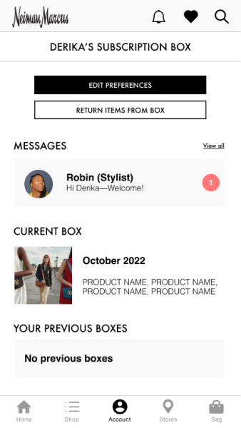
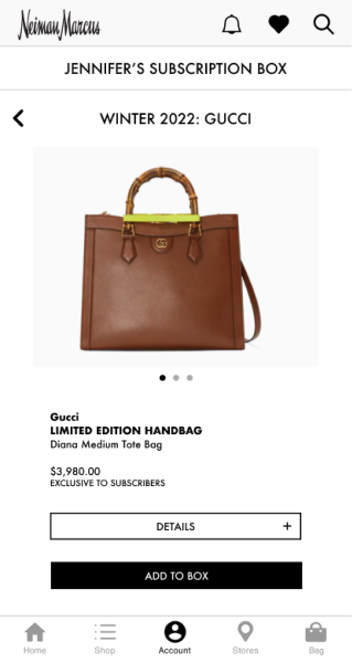
I was working with the retail team and partnered with Neiman Marcus to enhance their mobile shopping experience for both customers and company associates. As a design lead, my focus is to integrate UX, design, tech, and business solutions into NM.com and the NM App, create brand style guides and bridge the tunnel between a variety of teams. We created an exclusive premier-access subscription box service with specially curated items by a personal stylist for each customer. This service would help each person achieve their desired looks in a timely fashion. We focused on unique looks tailored to customers’ specific needs helping them feel great. Full design disclosed is under a NDA.
Discover
Challenges + Opportunities
Neiman Marcus recently filed for Chapter 11 bankruptcy and is closing stores nationally. Additionally, they never fully recovered from the ‘08-’09 recession, and have continued to struggle as a result of COVID-19.
“People love Neiman Marcus. So how can we create an even deeper emotional connection? Our selling associates do that so well every day, so how do we invest in technology that enables them to do that more?”
Our idea
We will create an exclusive premier-access subscription box service with specially curated items by a personal stylist for each customer. This service will help each person achieve their desired looks in a timely fashion. We'll focus on unique looks tailored to customers’ specific needs helping them feel great.
Why a subscription box service?
“We are shifting from a transactional economy to a relationship-driven one. A subscription is a recurring touch point with the customer. It’s that constant reminder that people have a relationship with the brand.”
Research
Competitive Analysis
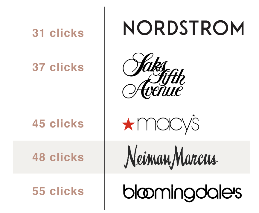
- We first identified key direct competitors in the luxury department store space
- Completed a task analysis on each brand’s mobile app, including Neiman Marcus
- Task: Order a complete outfit of a top, pants, and shoes
- Conclusion: Compared to its competitors, NM users had to click more often in order to order a desired look
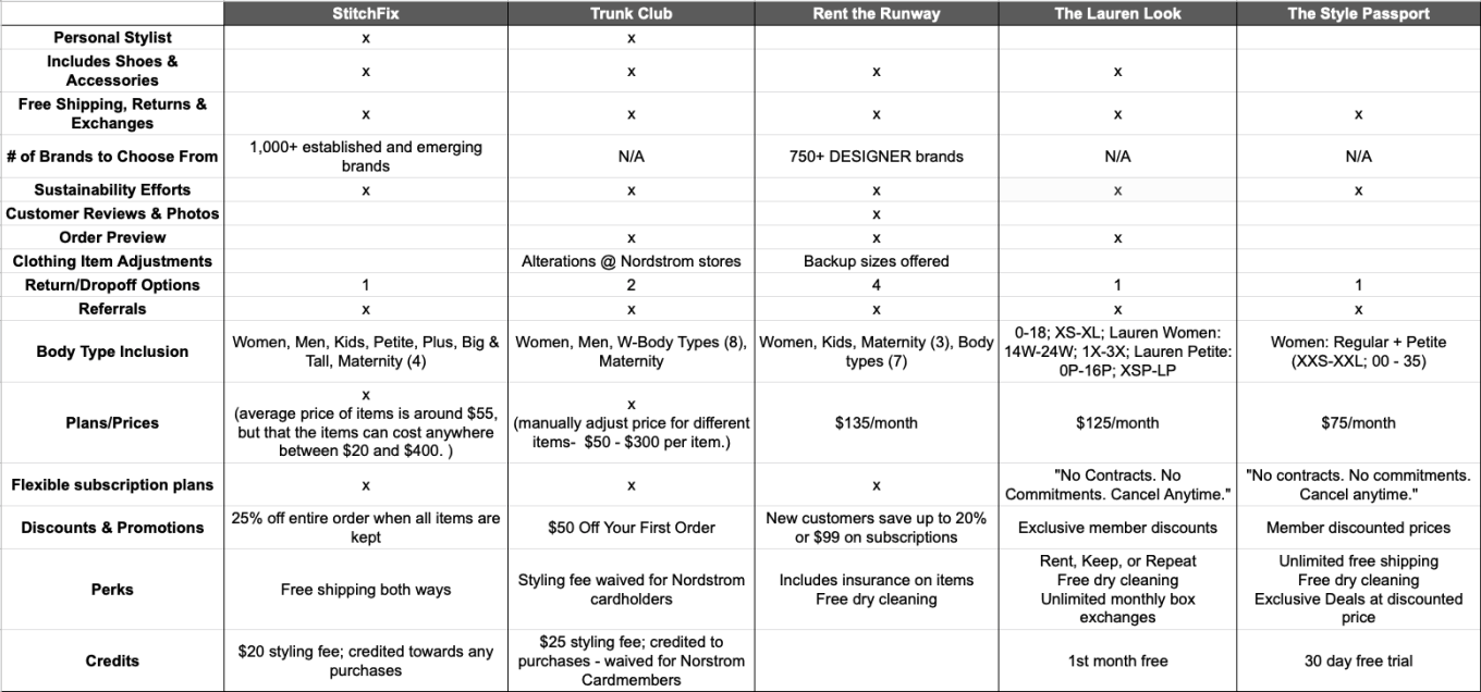
Comparing features

UI Differences
Comparative Analysis
Define & Develop
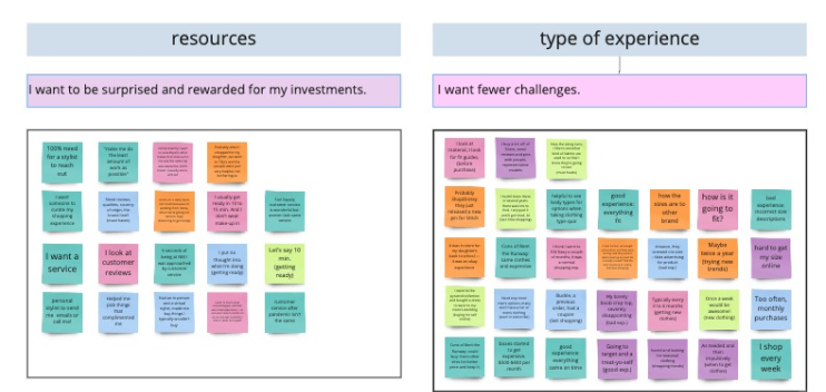
Affinity Mapping
Personas
Persona 1

Persona 2

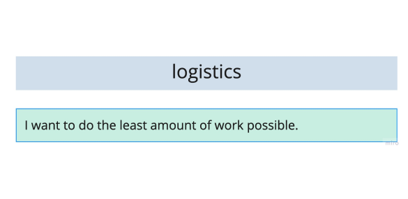
Gains, pains, and jobs

We sorted the insights we received from user interviews into categories:
What they wanted to achieve in their shopping experience
What obstacles exist in accomplishing the tasks they are trying to get done
What key jobs need to be achieved expressed in their own words

We prioritized our gains, pains, and jobs in order of importance and we learned a few things about who we are designing for:
They want to take the guesswork out of shopping
They want to save time on shopping
They hate returning things due to a bad return process
Trendy clothes feel good on them
Problem/Opportunity statements
Jennifer is highly-individualistic and a decisive shopper—she knows what she wants in her clothes and accessories without the cost being a barrier. However, these items are in such demand, that an issue arises with being able to snag those desirable items before everyone else. There’s an opportunity to offer customers exclusive windows to view and purchase new luxury items, thus retaining happy, loyal customers.
Derika is looking to update her current style but isn’t sure how to start or where to look. This means she is open to trying new things, but doesn’t want to spend much time shopping and often gets decision fatigue. There’s an opportunity to take the guesswork out of shopping, thus freeing up valuable time for our customers.
How might we statements
HMW help our customer feel better about their individual tastes?
HMW find a unique look to be ahead of the trends?
HMW help the customer find valuable items?
HMW define a valuable item for our customer?
HMW offer a valuable feature or experience for our customer?
HMW help our customer find the right size?
HMW enhance the quality of items that they receive?
HMW make their return process convenient?
Brainstorming features
“What if we had an AR feature on your camera and try on looks that way.”
“Wouldn’t it be cool if there were special occasion boxes like “Black Tie Event,” “Maternity” or “Upcoming Interview.”
“Can subscribers have access to livestreams of NYFW in the app and they can pre-order what they see.”
“Is there a monthly designer box like ‘March is Gucci.’ Subscribers would get an exclusive item from Gucci that isn’t available to the public.”
“What about if Neiman Marcus could drive to your place and let you try on clothes for a few hours?”
“I wonder if Neiman Marcus could gift people with a tablet that is preloaded with a catalog with next year’s fashion trends.”
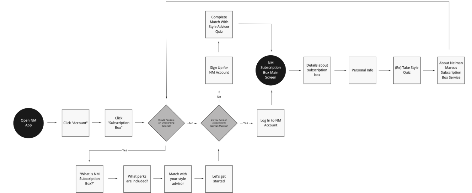
User flow 1: Onboarding
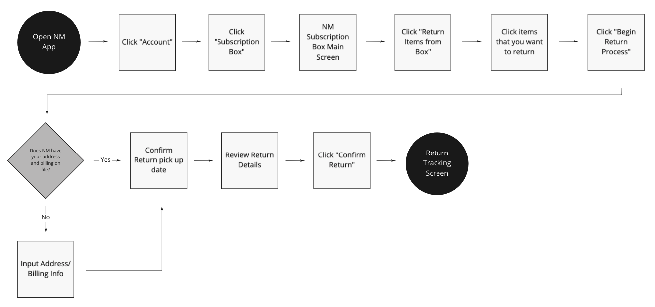
User flow 2: Returns
User flow 3: New Subscription Box

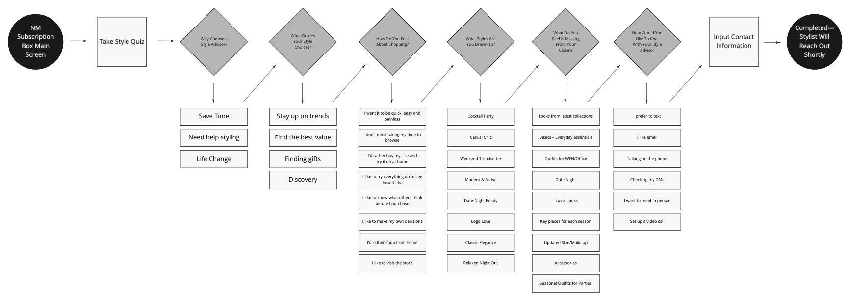
User flow 4: Style quiz
Design
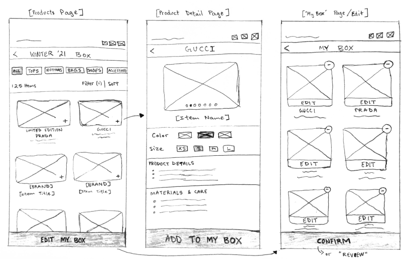
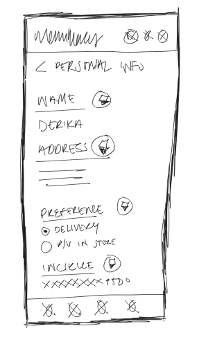
Sketches
Wireframes (Selected)
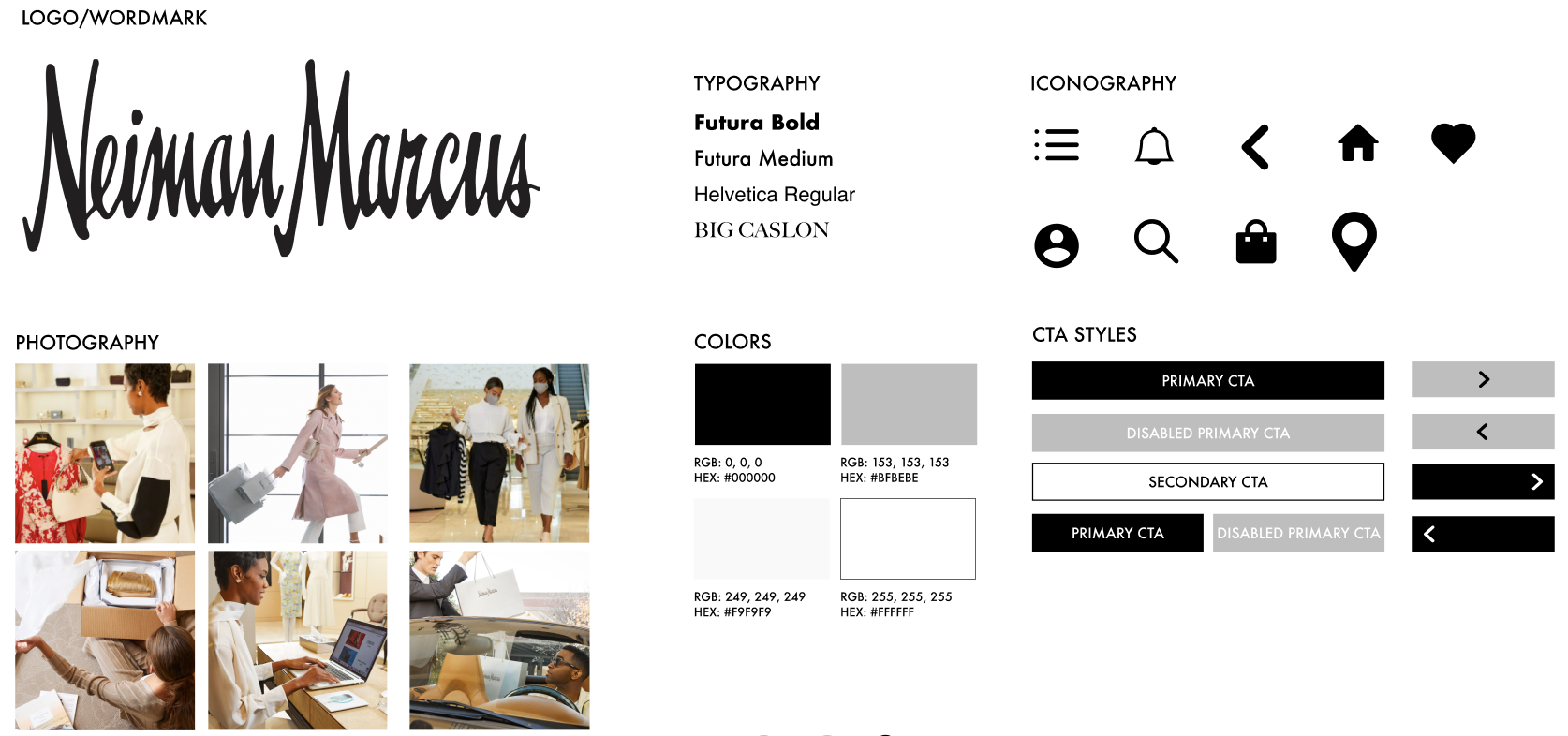
Style guide
Delivery
User Interviews
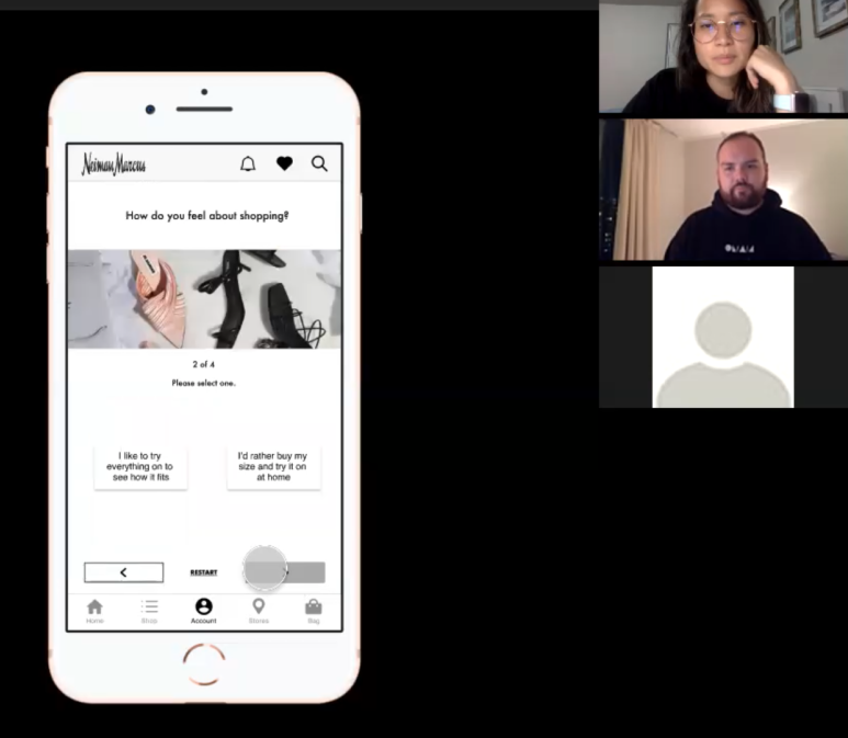
- Tested three users
- Tests were moderated over Zoom, including at least two members from the team to lead and observe
- Took users on average 23 minutes to complete the three flows with a total of (9) tasks
SUS Survey

Conclusion and next steps
The first round of usability testing revealed our user’s pain points and roadblocks while navigating the prototype. One key takeaway was to make the new subscription service more visible on the home page. We conducted the second and final usability test after iterating on our design and asked our users to fill out a SUS survey at the end. Our final design earned a score of 87% / excellent rating.
Up next would be to improve integration within the NM ecosystem, including their InCircle Loyalty Program. Include themed-boxes. Marketing and testing of a subscription feature name. Algorithm implementation within the interface.


