Beat Hub
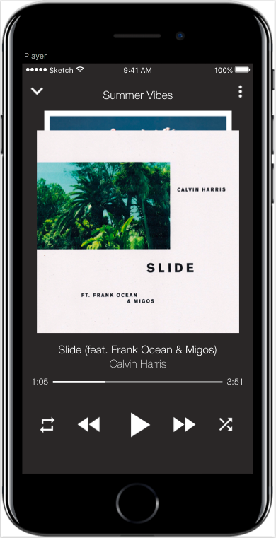
This is a music playlist app design that I created with sketch. It has the primary ability to add songs to the playlist, create multiple playlists, and remove songs from the playlist. The app serves a purpose of a creating a very personal hub of music. Even if you need help making a playlist, there is an option to have one made for you from your interests and history. Tools used: Sketch and Adobe Illustrator

Home Page
- Will display a list of playlists you have created
- Has the functionality of being able to create New Playlists
- Each playlist can be tapped to bring you to the page for the respective
playlist you tapped on
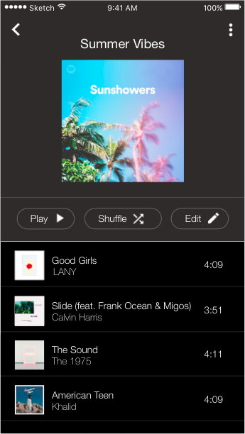
Playlist Page
- Will display the name of the playlist in the navigation bar of the
playlist it transitioned from
- Has the functionality of being able to add and remove songs

Many of today’s most popular design trends (such as flat design, hero images, and hidden global navigation) are directly influenced by minimalism, a web-design movement that began in the early 2000’s. The philosophy of minimalism sounds very simple — “less is more.” In web design, less is more is achieved by using only elements that are essential to a given design. A minimalist web-design strategy is one that seeks to simplify interfaces by removing unnecessary elements or content that does not support user tasks, because:
The less elements on a screen, the more potent the remaining ones become
By that logic, if you had only a single element on the screen, you could be sure that your message is communicated to the user.

What this shows..
Minimalism is the intentional stripping away of everything that distracts users from content. But at the same time you must be sure that you aren’t making your users’ primary tasks more difficult by removing or hiding content they need.
Negative Space
It should be no surprise that the most common element in minimalism is no element at all. Negative space — also known as whitespace — is the most important feature of minimalism, and what gives it much of its power. It serves to manipulate the user’s visual flow:

The more negative space around an object, the more the eye is drawn to it
Visual Characteristics
In a minimalist design, every detail has significance. What you choose to leave in is vital:
- Flat textures. Minimalist interfaces often use flat textures, icons and graphic elements. Flat interfaces don’t make use of any of the obvious highlights, shadows, gradients, or other textures that make UI elements look glossy or 3D.
- Vivid photography. Images are the most prominent form of artwork in minimalist design, they enable an entire world of emotional connection and set an atmosphere. However, remember one key tip when selecting the photo: all the visual minimalist characteristics should be present in selected image. Choosing a wrong image (e.g. busy photograph full of distracting items) can negate the benefits of the surrounding minimalist interface.
- Color Minimally. In minimalist design we use color to create visual interest direct attention without adding any additional design elements or actual graphics. Since you should design with fewer colors, you need to get creative when it comes to creating a visual hierarchy.
- Contrast. Because you should design with fewer elements, you need to get creative when it comes to creating a visual hierarchy. In the We Ain’t Plastic example below, you see the staple of minimalism, the white background contrasted with the black threshold.