IBM: Training Home
This was a task where I was asked to redesign the IBM Training homepage. The process involved user research where there was an in-depth review with metrics and analytics, along with task analysis to check clicks. When it came to design, the homepage was brought to new light with new design components that provided improved visuals and functionality. The full design disclosed is under an NDA.
Creating an effective homepage is a mega-challenging task–and it doesn’t surprise me how often even well-intentioned and smart attempts fail, or at least get bad marks.
How do you make a home page all things to most people? How does it explain who you are, and what your business or product has to offer, while drawing people in and encouraging a longer term conversation? If it’s a site that features ads, how do you create a page that integrates them successfully into the strategy? And then, once you’ve made a homepage and a couple of years go by and you decide to change it or to how you handle the blowback from users who liked it the way it was.
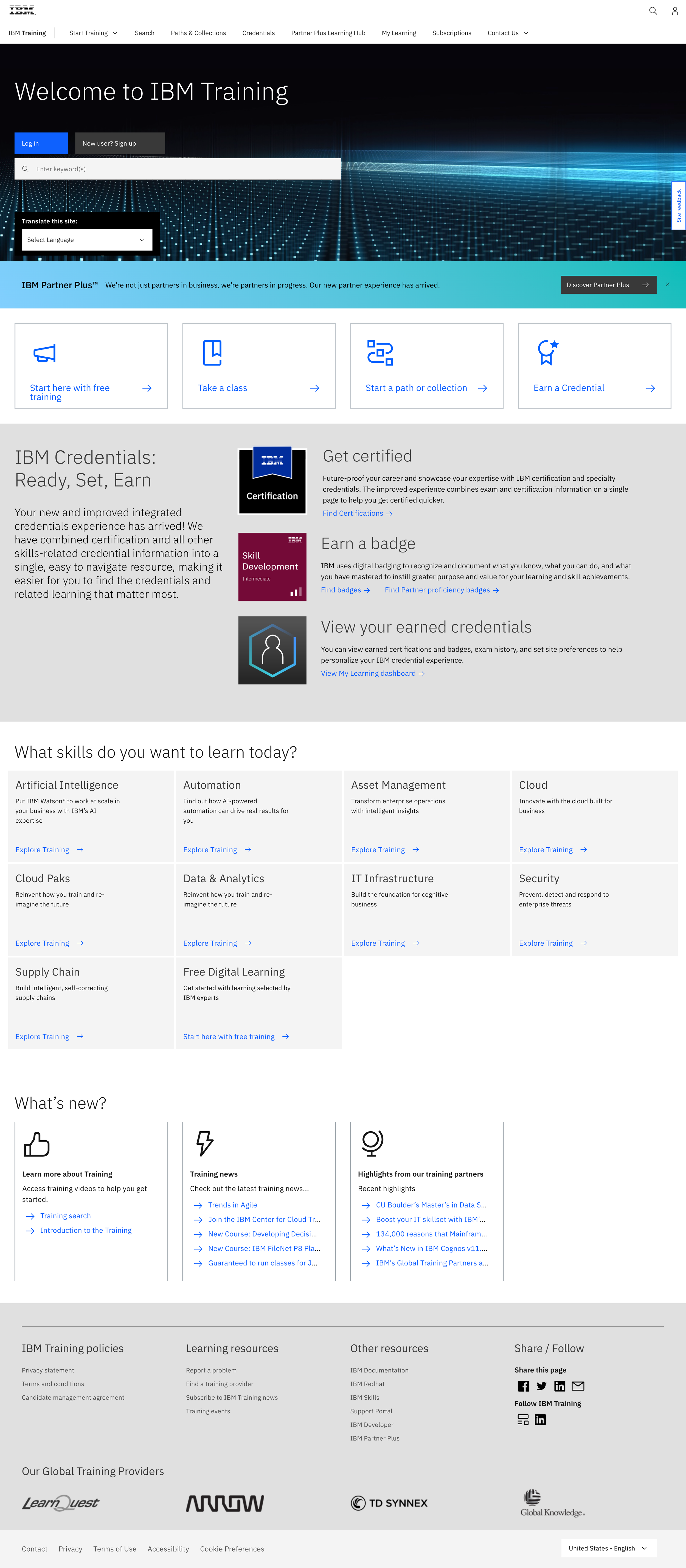
Current design

What is wrong with this?
When it comes to the current design, there seems to be a lot going on at once, especially in the masthead. The structure and layout of the buttons is quite unwelcoming and needs better placement. Going down the screen, you see a lot disproportional with the card jump-boxes, the big grey “how it works” piece, skill boxes, and the what’s new. The one piece that really screams is the icon usage in that grey box. It just looks to be bit much and takes away from the page. The homepage should be less of a hub, but more a place to get from point to point.
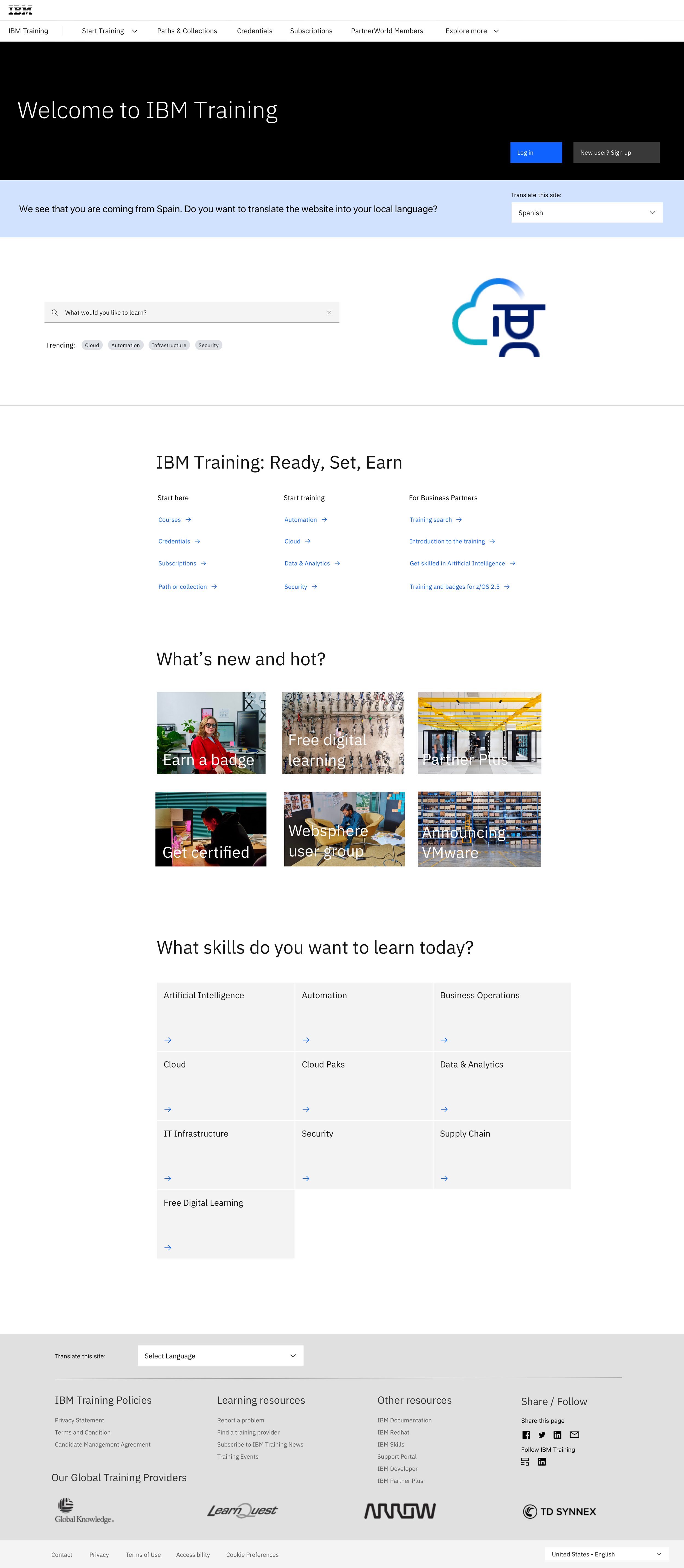
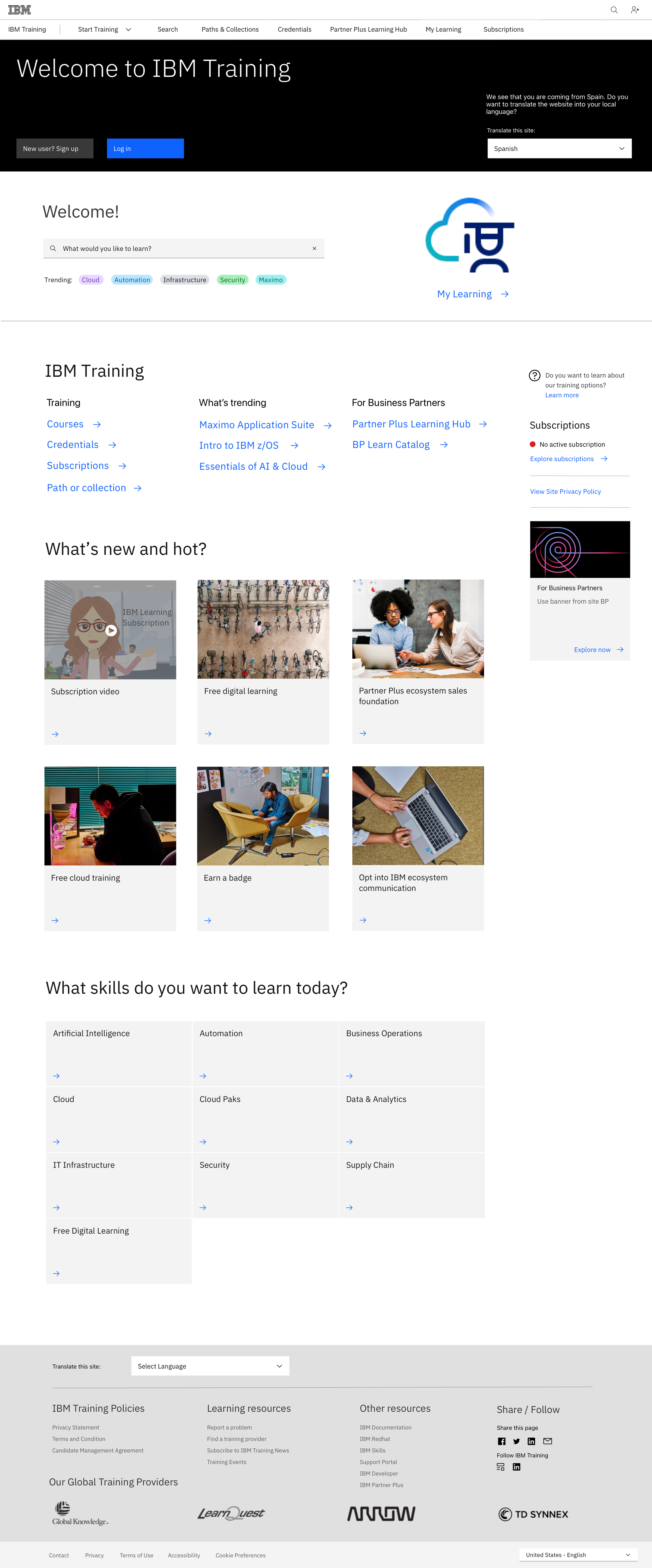
New ideas
“The homepage is an entry point and is used to convert.”


