
Camp on the Go
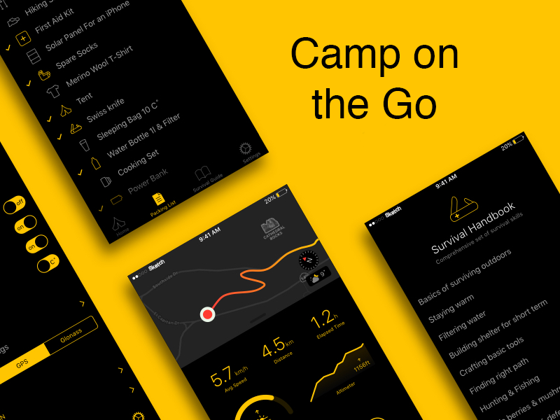
Designed a smartphone app artboard that gives the camping experience more to it, such as walking steps, nearest campsites, recommended gear with direct shopping access, and a blog and forum aspect. The app is directed to both first time campers and long time adventurers. Technologies Used: Adobe Photoshop CC, Sketch
Technology sometimes takes the rap for our couch potato lifestyle — it’s never been easier to live life through our phones.
The interviewing and research phase
I had to jump right in, no time to waste, those two weeks were going to move FAST and I knew I needed to start with my research and interviews. I decided that I would first build a survey and see what type of feed back I might get form my social media. In 2 quick days I had 49 responses all about my camping survey. I realized quickly that I had a lot of data to comb through just from my survey results.
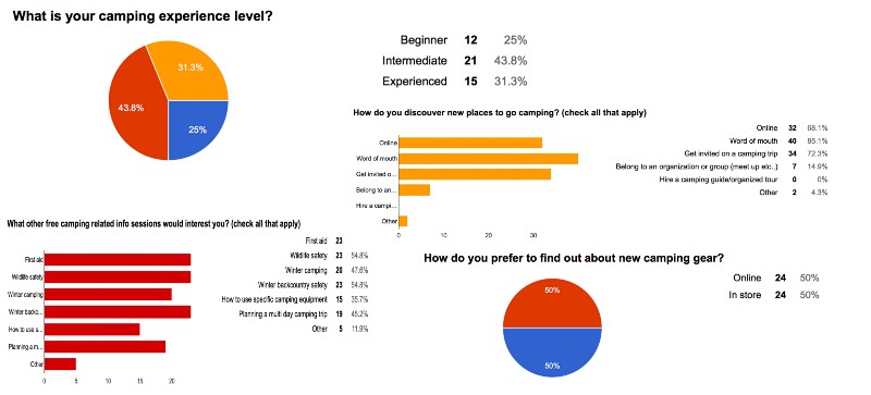
On top of all the data that I have received back via my survey, I knew I alsoneeded to set up some in person interviews, and take a chance to chat with people I knew and people I was just meeting for the first time all about their camping experience. I had developed a line of questions that revolved around not only camping an what they like about it, but also their e-commerce preferences and their thoughts on the perfect app. I ended up conducting five in person interviews and learning all kind of interesting things about the people around me and their camping preferences.
From all this research I gathered a clear and consistent problem arouse. Organization! This seemed to be the problem that fell upon all my users. New to camping or old pros, how do you keep it all organized?
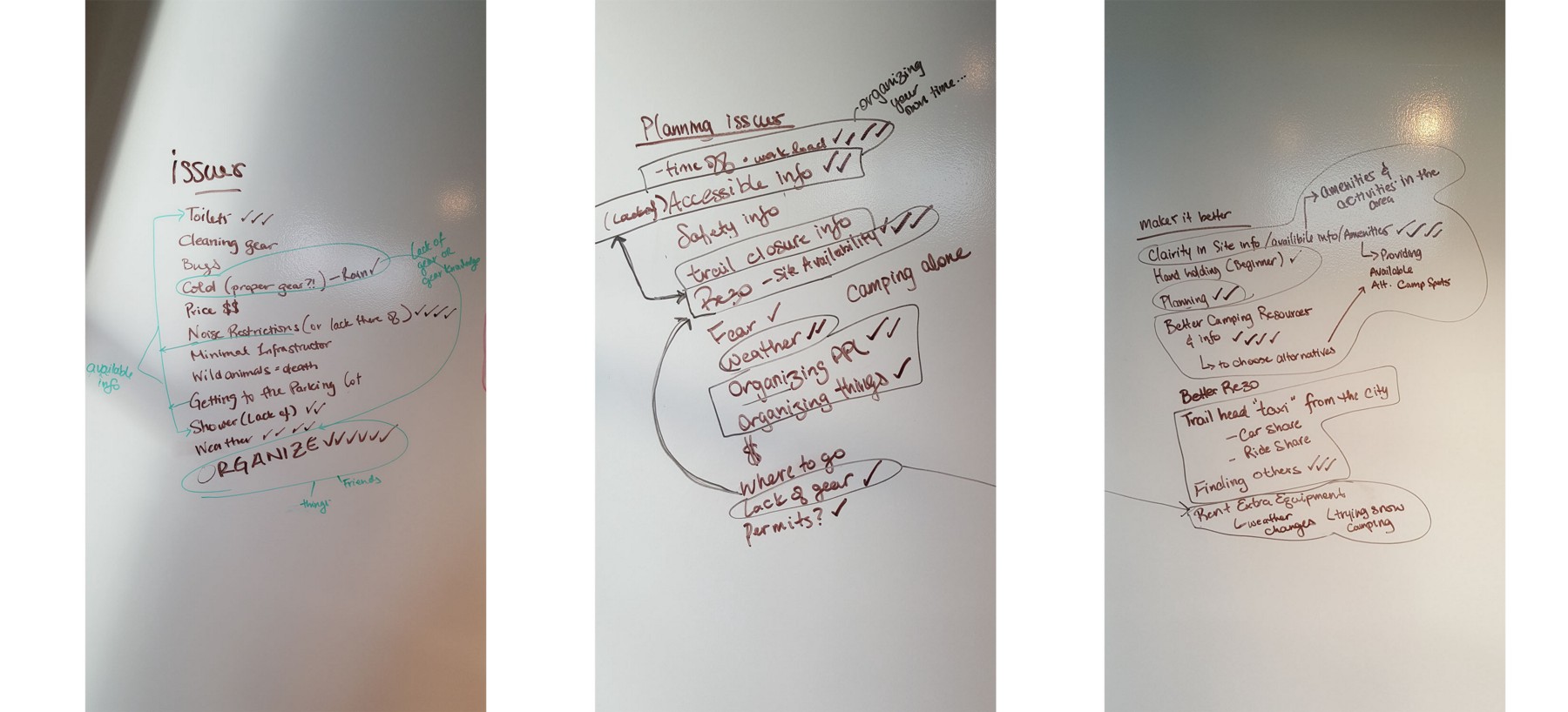
I realized organization compiled with learning about campsites and parks as well as learning about what gear one might need at a specific time of year were my three user goals, and the second two, they met the needs of my client as well!
Introducing the design
I developed and re developed my prototype through 4 versions before the end of my two weeks. I tried one version, sketched it out on paper, played in sketch, went back to paper, then would walk away and try not to think all about every little detail… I would realize that I need to think about this or that, and the hierarchy of it all, how to denote what was controlling the page, and how the user could move around, back and forth through the web app.
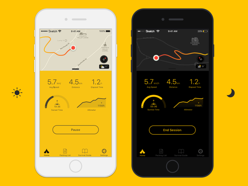
Carries a day and night mode for viewing preferences
Off I went to see my first user, we were meeting over lunch and going to have a chat about my web app as he moved through the interface I had painstakingly built, the product of my hours of blood sweat and tears, now resting in hands.
The process was insightful to say the least. He was open and honest and gave tons of great feed back about what he saw and how he felt about what he was using. Some of the feedback was great, and some of it was even useful, and it lead me to show my work to another user and get more feedback. I felt like I was learning so much, but also knew it was back to the drawing board for some of these elements too!
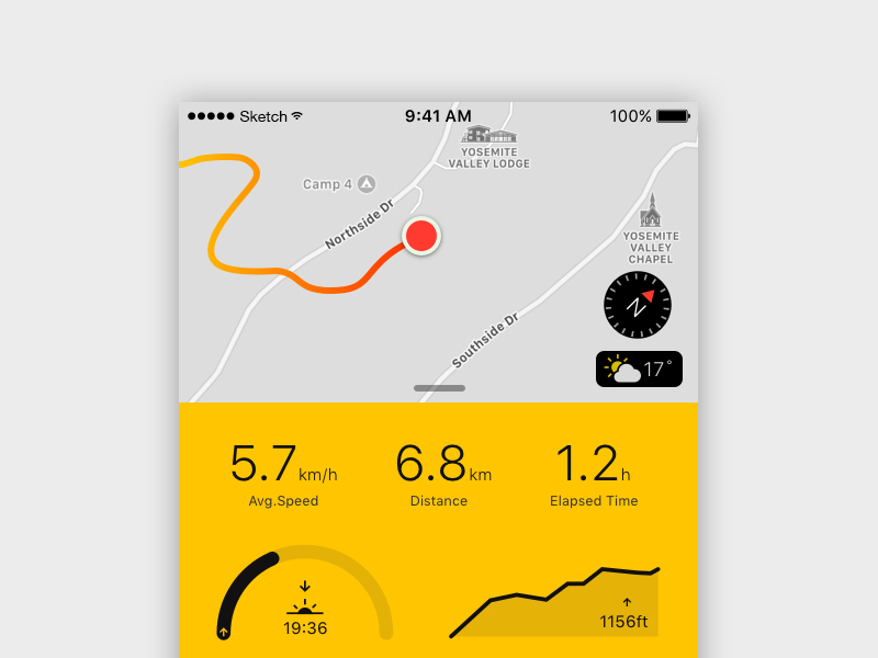
Two Screen Interfaces?
Many studies have shown that the bright blue light emitted by our devices has a negative effect on our sleep because it throws off our circadian rhythm. The light tricks our bodies into thinking that it’s still daytime so it produces less melatonin in the evening (the hormone that regulates your zzz’s).
To get better sleep, it is recommended that you turn off all devices a couple hours before bed. But if we’re being honest here, few of us are disciplined enough to stick to this rule. The second best solution is to adjust the brightness and color of the screen according to the time of day, which is exactly what night shift does. This is exactly what human-centered design advocates.
It’s a development framework in which designers gain a deep understanding of their users to build a product or system that adapts to their attitudes and behaviors, instead of working against them. A big part of understanding users is specifying the context of use: when, how and under what conditions will people use the product.
All in the wrist
If what most apps are doing is essentially strapping phones to our wrists and removing most of the functionality (or worse, keeping it), we’re missing the boat. We need to re-think what smart watches are for, and here’s what I think it comes down to:
iPhone is alternate reality; Apple Watch is augmented reality.
I learned a ton about the UX experience building this app, it was really informative, and also showed how much work goes into the building and development of something from nothing. I would love the opportunity to go back in and refine more and more till it was one smooth movement from screen to screen.
I think I would also like to go back in a redesign the camp app for Apple Watch
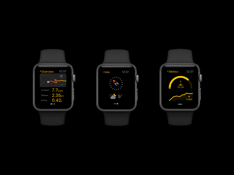
Journey on your wrist
When you’re designing for Apple Watch, make sure you understand the context for your use case — not just how people will interact with the app itself, but what they’re doing “in real life” around those moments, and when you should intervene. If you can describe the features you’re designing but not the moments you’re designing for, you have more work to do.
The goal isn’t to get people to spend more time looking at their screen — it’s to free people from looking at their screens so they can engage in their surroundings more attentively and intelligently. There are a few things Apple Watch can do well, and lots of things it can’t. Play to its strengths and have a highly focused vision for why your app needs to exist in addition to an iPhone or iPad app.
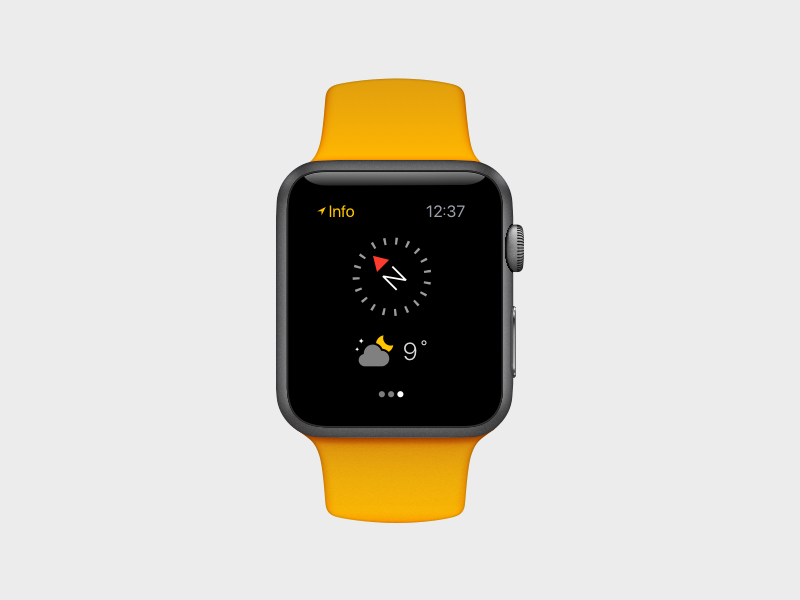
When creating this, I noted that Apple Watch is about evolving the role of mobile devices, moving them out of the way of human interactions and into a truly supportive background role. Rather than creating a competing world to live in, it’s about helping you live better and more attentively in the one you already have.
Future Considerations
I am really happy with the overall product design, I feel like it came together well, meeting my research and creative needs in a simple and highly visual manor.
What I would love to develop further is the User Profile section, add in a way to develop a user profile about yourself, help better rate your hiking experience and possibly build in a feature to meet other users. I also felt that the app would benefit from a way to meet other hikers and organize hikes together. This would facilitate having different skill levels be able to come together and car pool or organize trips.
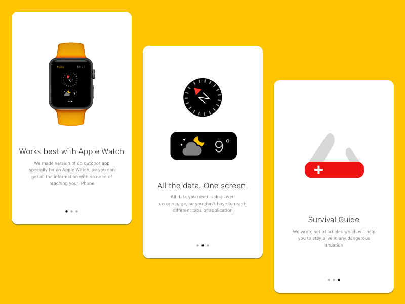
Introduction screens.