09 / Vitalis · Health dashboard · 2025
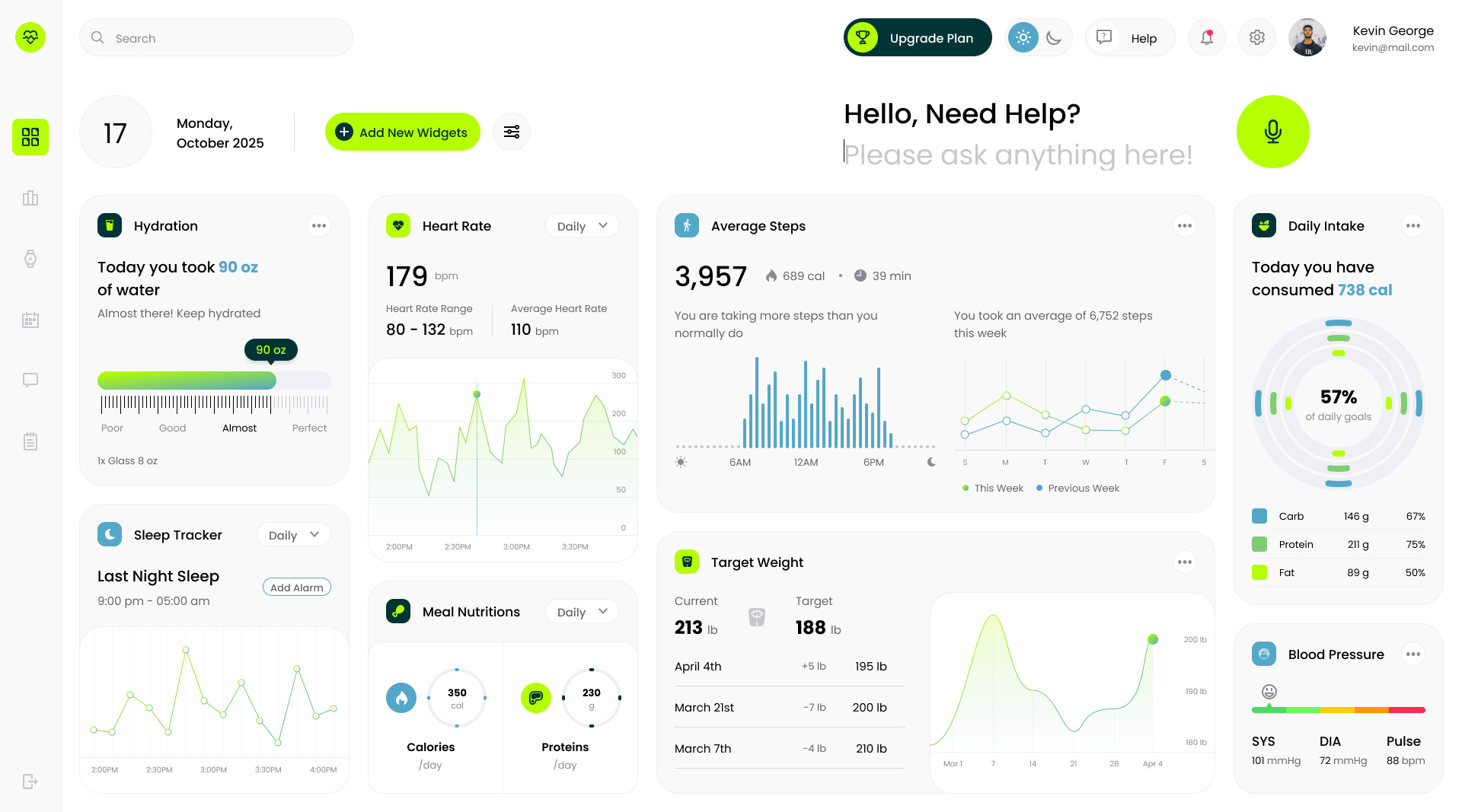
Landing and product concept for an AI-assisted health tracker, hydration, heart rate, sleep, and intake, laid out so the day's answer sits above every widget.
Role
Product designer · brand and UI
Team
Solo, concept work
Duration
1 week
Platforms
Web dashboard · Marketing site
Problem
Health apps show numbers. They rarely answer the question you opened them with.
Most tracker dashboards pack a dozen widgets onto one screen and leave interpretation to the user. Vitalis started from the opposite instinct: lead with a plain-language prompt at the top of the surface, and let the widgets defend the answer underneath.
Process
One prompt, then a widget grid earning its slot.
01 · Prompt-first hierarchy
The top of the dashboard is a conversational input, not a chart. Widgets sit below and support whatever the user asked.
02 · A widget system, not a layout
Every card follows the same anatomy: icon, label, single headline number, and a small chart or ring. Adding a new metric is a slot, not a redesign.
03 · A palette that reads as health, not hospital
Lime green as a single accent against neutral surfaces, so state (good, almost, perfect) reads instantly without a legend.
Results
A concept that treats the dashboard as an answer, not an archive.
1 prompt
above every widget
9 widgets
on one unified grid
1 accent
carries all state
The concept ships as a landing page plus a dashboard mockup. The design bet is that leading with a question, then defending it with data, is more useful than the reverse.
Next case study
Marketing site for a collaboration tool that isn't shy about it
Aligno · SaaS landing