10 / Aligno · SaaS landing · 2025
Landing page for Aligno, a team collaboration SaaS, structured around three plain questions: what it does, why it's different, and how to start.
Role
Product and marketing designer
Team
Solo
Duration
1 week
Platforms
Marketing site
Problem
Every collaboration tool's landing page looks the same.
Aligno needed a marketing site that read as opinionated software, not a category placeholder. The brief was to lead with a concrete claim (collaborate smarter), back it with proof modules, then walk the reader through the workflow.
Process
Three sections doing three jobs.
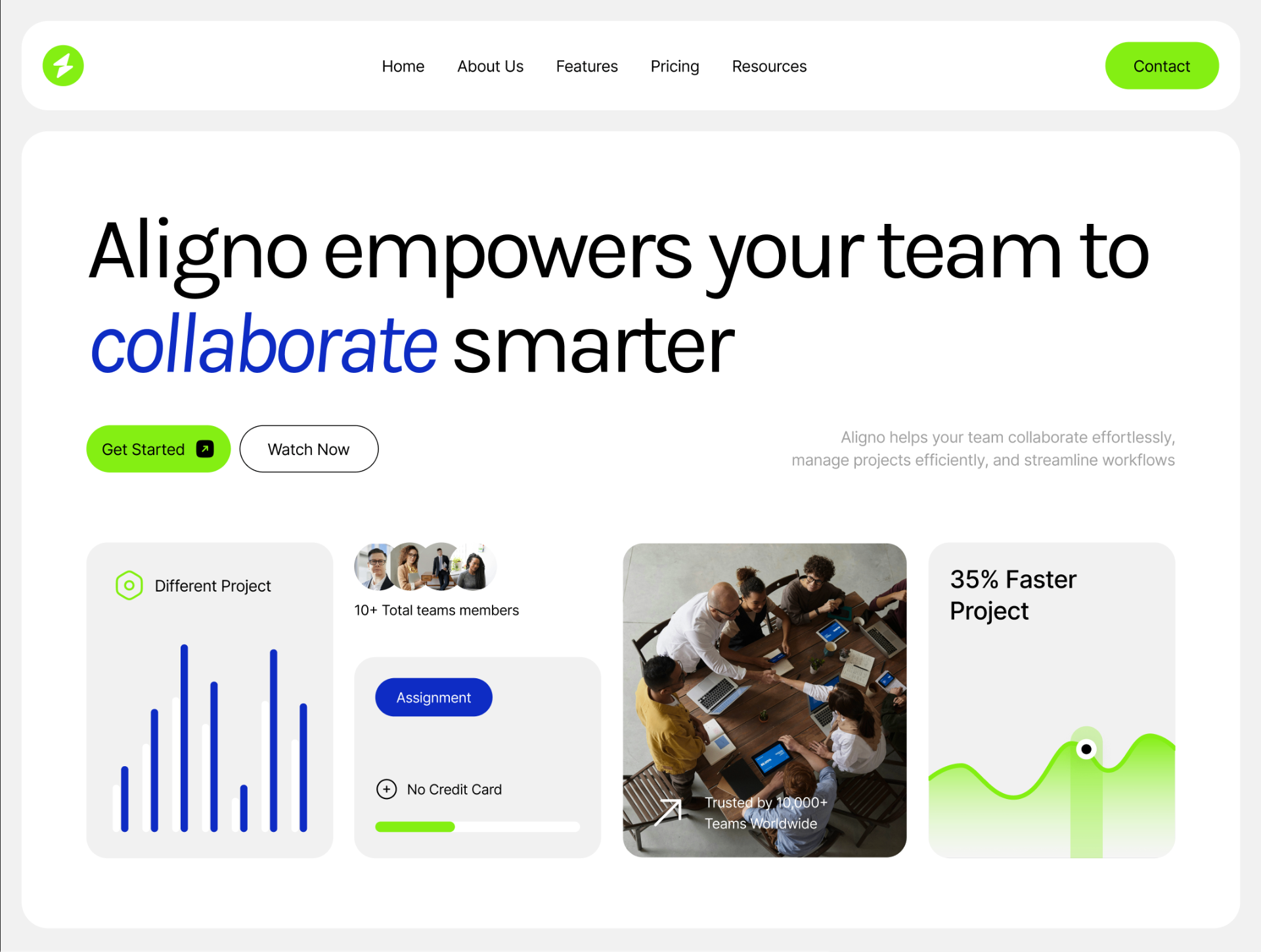
01 · Hero with proof, not a stock illustration
Small product screenshots and a team photo sit inside the hero, so the first fold shows the thing, not a metaphor for the thing.
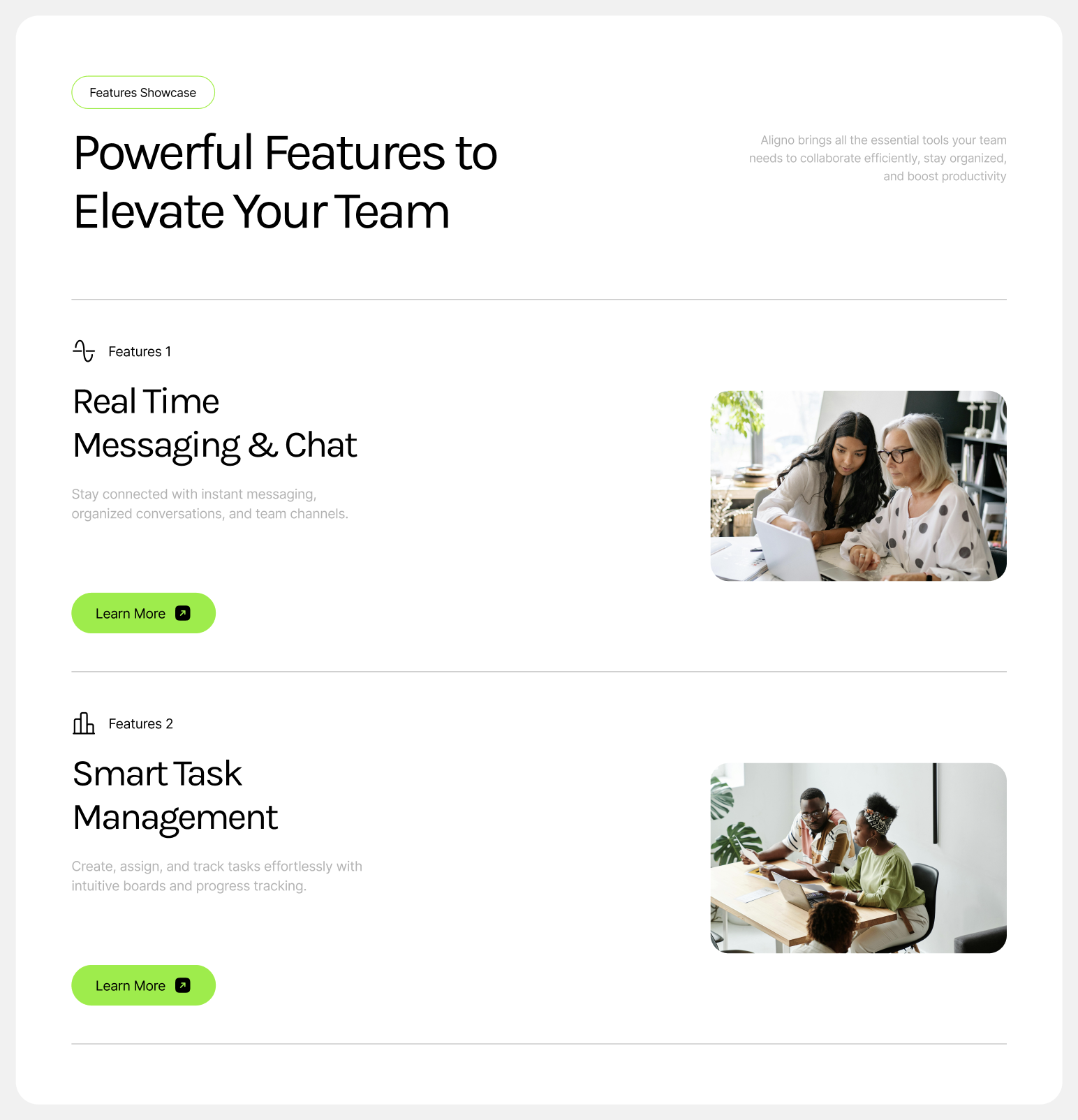
02 · Feature stack that earns the scroll
Each feature is one row: numbered label, headline, short body, and a real product image. No parallax, no gimmicks.
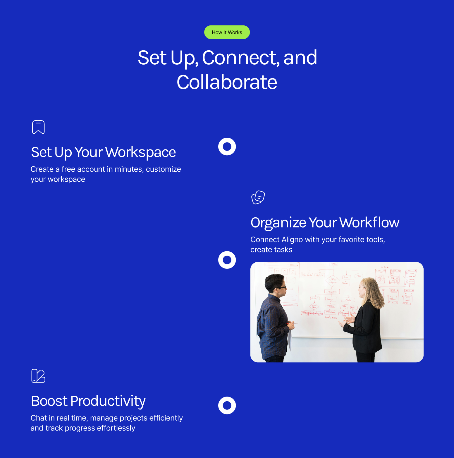
03 · A vertical timeline for onboarding
Set up, connect, collaborate. Rendered as a spine on a blue field so the story of using the product is visible from thirty feet away.
Use cases
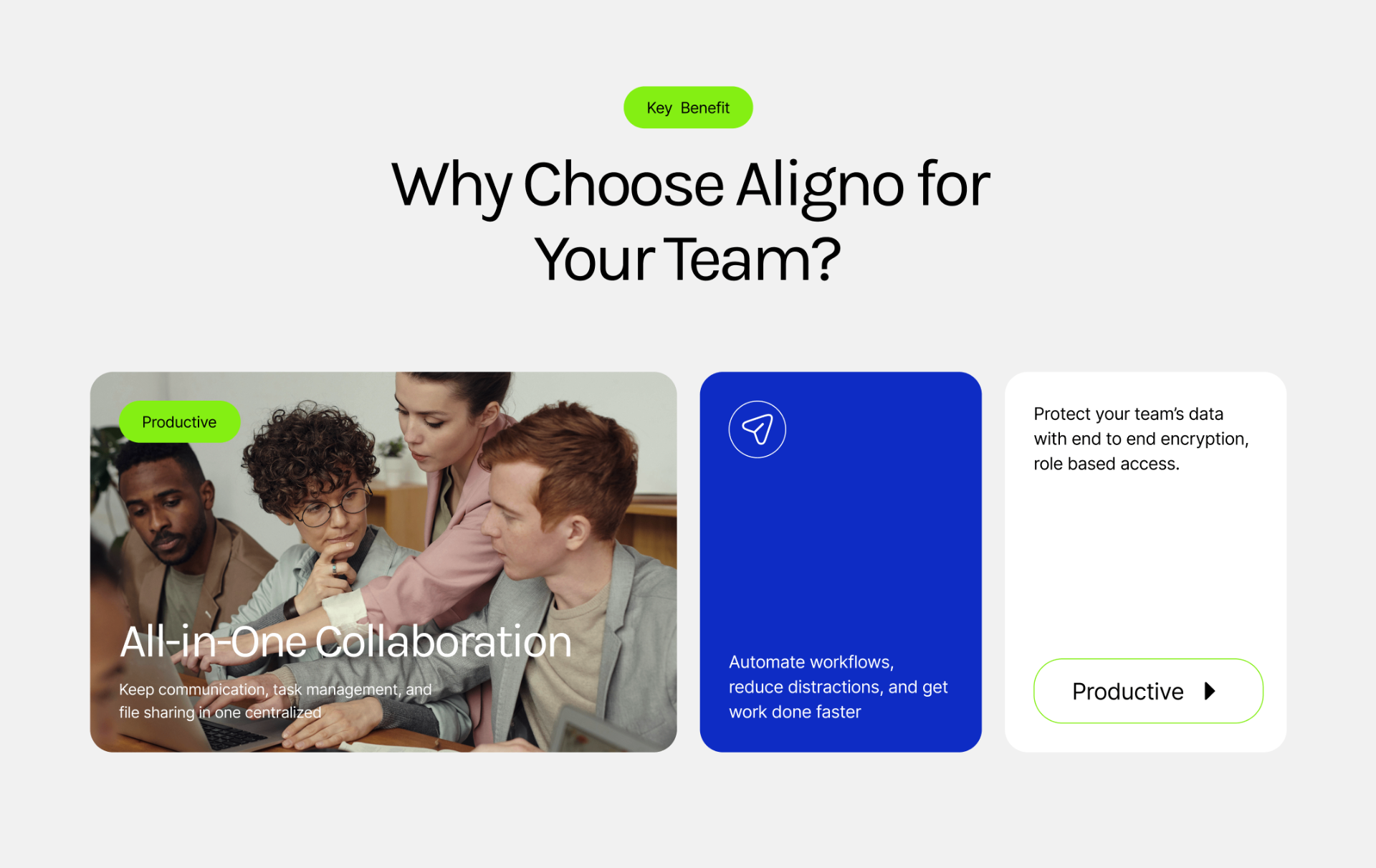
Key benefit, laid out as three cards.
Why Choose Aligno for Your Team
The benefit section is a three-card row: a photo card anchoring the human claim (all-in-one collaboration), a solid blue card carrying the workflow message, and a paper card with the security note and a call to action. One accent color, one green tag on top, and enough negative space that each card can be read on its own before the eye moves to the next.
Powerful Features to Elevate Your Team
The feature showcase is a two-column rhythm: numbered label and large headline on the left, a rounded product photo on the right, separated by a hairline rule. Each row does one job (real-time messaging, smart task management) with a single green Learn More action so the eye always knows where to go next.
Set Up, Connect, and Collaborate
The onboarding story is a vertical spine on a full-bleed blue field: three nodes (set up, organize, boost) alternating left and right of a hairline rail. Icons sit above each headline so the step is legible before you read the body, and a single photo lands on the middle beat to break the type rhythm without derailing it.
Results
A page that reads as a product, not a promise.
3 sections
hero, features, onboarding
1 accent
green as the only signal color
0
stock illustrations
The final site holds a clear reading order from claim to feature to first-run experience, without leaning on the generic SaaS visual vocabulary the category defaults to.
Next case study
Editorial hero for a talent agency
Altura · Modeling agency