07 / IBM Training · 2023
Program-manager view of learner outcomes across cohorts, from progress rings down to per-module drop-off.
Role
Senior Product Designer
Team
1 designer · 3 engineers · 1 PM
Duration
4 months
Platforms
Web dashboard
Problem
Program managers had reports, not answers.
IBM Training's program managers received weekly PDFs. The PDFs answered 'how are cohorts doing?' but not 'where is a learner stuck, and what should I do about it?'
The team wanted a live dashboard, but the risk was drowning managers in charts.
Process
Design around three questions, not thirty charts.
01 · Question framing
Interviewed program managers to distill the dashboard into three questions: who's at risk, what's blocking them, and which module needs a rework?
02 · Risk-first layout
The 'at-risk learners' list is the top-of-page primary. Everything else is context around that decision.
03 · Module drill-through
One click from a module tile takes you to the per-question drop-off inside that module, turning 'what's broken' into 'here's the exact quiz item.'
Results
Weekly PDFs quietly disappeared.
2.6×
at-risk interventions per week
−31%
cohort drop-off after 60 days
12
modules reworked in first quarter
Program managers ran more targeted interventions in the first month than the previous quarter combined. The module drill-through surfaced twelve high-drop-off quiz items that were rewritten within the first quarter.
Next case study
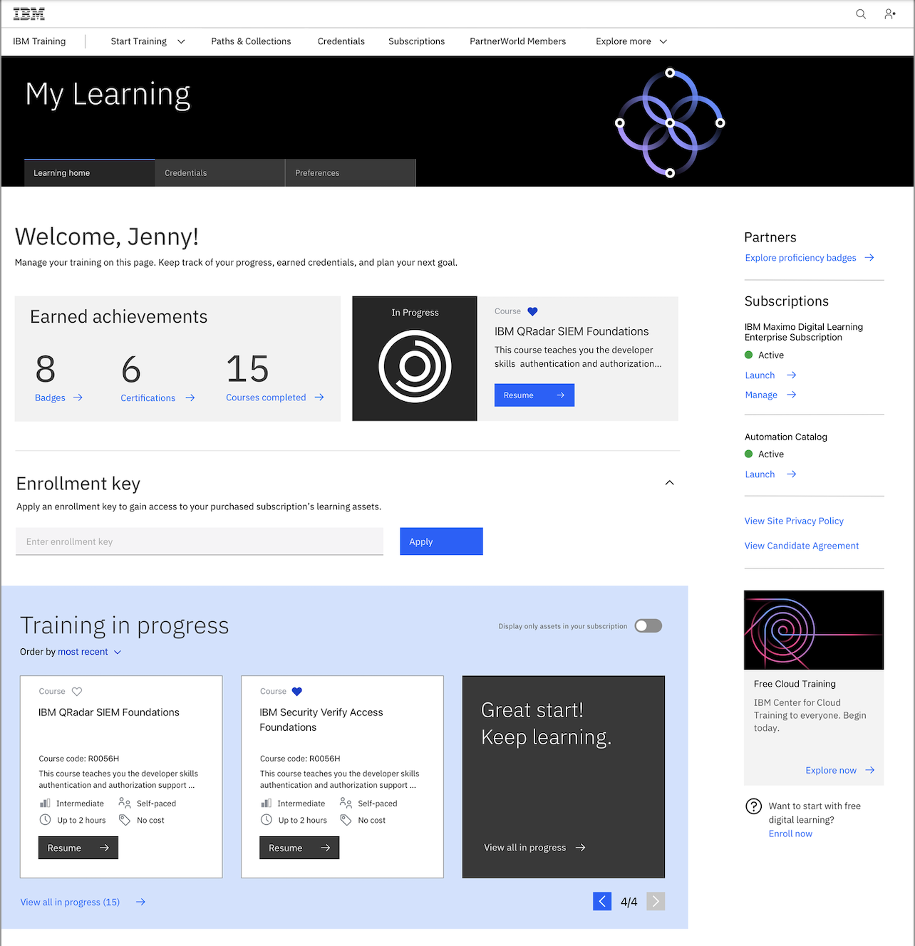
Employee learning home
IBM Training