21 / Pulse · Health & Fitness · 2026
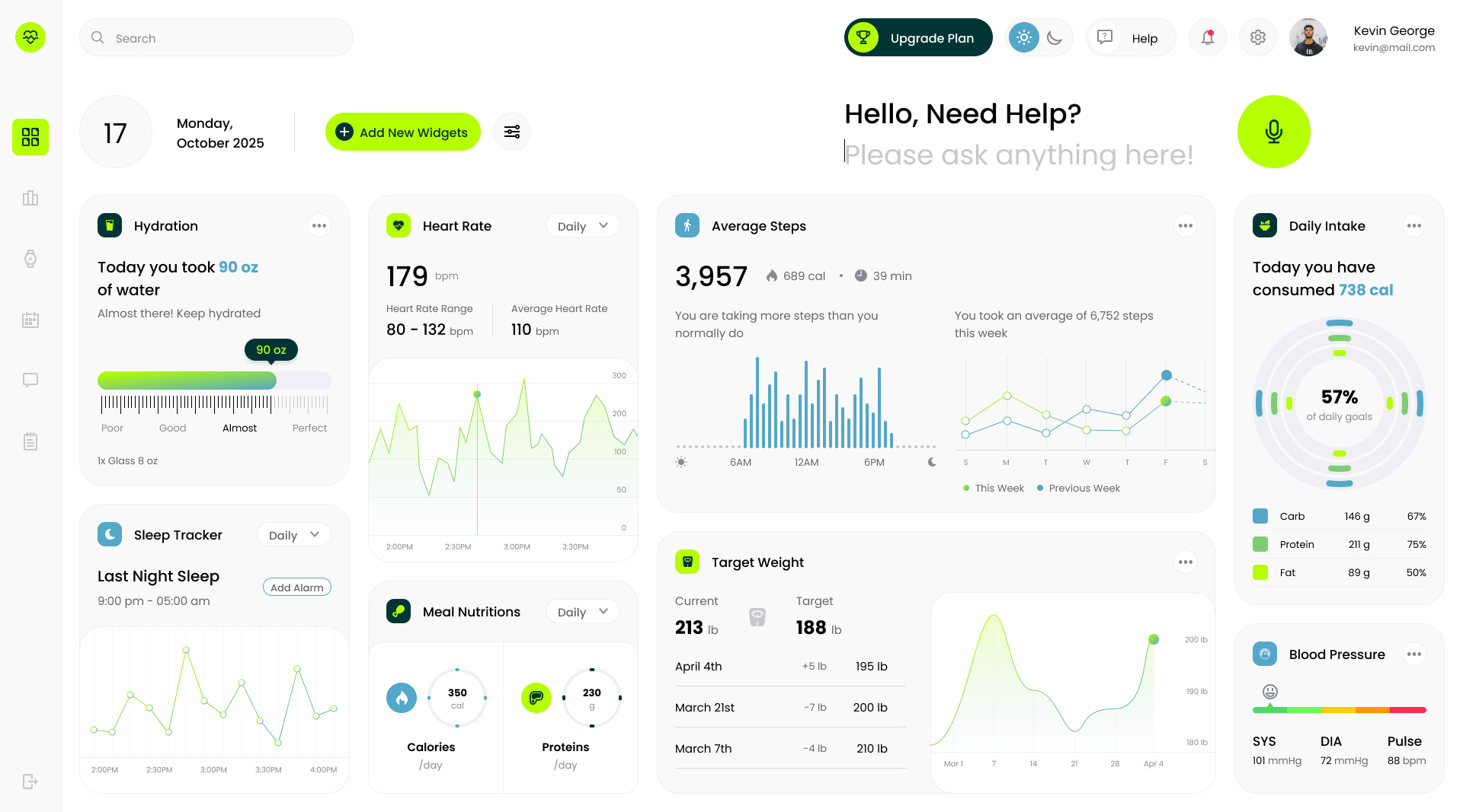
Concept dashboard for a health and fitness tracker: activity rings, heart rate, sleep, and calories composed into a single dark-mode surface that answers 'how am I doing today' without digging.
Role
Product designer, concept
Team
Solo concept, self-directed
Duration
One-week concept sprint
Platforms
Web · Responsive
Problem
Fitness data is easy to collect and hard to read.
Health apps generate a constant stream of metrics: steps, heart rate, sleep stages, calories, workouts. Most dashboards answer with a wall of charts that each demand their own interpretation, so the user does the synthesis work the product should be doing.
Pulse is a concept for the opposite: one surface where the day's story is legible in a few seconds, with detail available on demand rather than competing for attention up front.
Process
Hierarchy by question, not by data source.
01 · The day's answer first
Organized the layout around the questions a user actually asks: am I on track, how did I sleep, how's my heart. Activity rings anchor the top as the summary object, with supporting metrics arranged by how often they change, not by which sensor produced them.
02 · Dark canvas, luminous data
Chose a dark-mode surface so saturated data colors carry the hierarchy. Rings, gauges, and trends each get a distinct hue, and nothing decorative competes with them.
03 · Cards with a point of view
Each card leads with its conclusion: a number, a delta, or a status, then the chart underneath for context. Sparklines and compact bar charts keep trends visible without turning the page into an analyst tool.
04 · Glanceable at any distance
Tuned type scale and spacing so the dashboard works as a morning check on a laptop or a glance across the room. The most volatile metrics get the most contrast; steady ones recede.
Results
One screen that replaces a morning of chart-reading.
1 view
for the full daily picture
4 systems
activity, heart, sleep, calories
Concept
self-directed, not a shipped product
The deliverable is a high-fidelity dashboard concept: a dark, card-based surface with activity rings, heart-rate trend, sleep breakdown, and calorie tracking composed into a single daily view.
On scope: this is a self-directed concept with placeholder data, not a shipped product. There's no live data pipeline or account system. It's an argument for hierarchy-by-question over hierarchy-by-sensor.
Next case study
Making the trip the focal point
American Airlines · Mobile app