02 / American Airlines · Mobile app · 2024 to 2026
Redesigned American's mobile Trip Details screen so the active journey, not the app navigation, is the first thing travelers see.
Role
Senior Product Designer · one of several designers on the redesign
Team
Cross-functional pod: product, engineering, research, brand, operations
Duration
Multi-year program
Platforms
iOS · Android
Problem
The old app made you hunt for your trip.
American's mobile app had grown into a set of loosely-related sections, flights, AAdvantage, upgrades, offers, alerts, each fighting for prominence on the primary surface. A traveler on the way to the airport had to navigate to find the thing they came to the app for: their next flight.
The redesign brief was broader than one screen, but the throughline I care about is narrower: the Trip Details view had to stop being a launchpad into the rest of the app and start being an answer to the question travelers actually open the app to ask, where am I in this journey, and what's next?
Process
One principle, applied honestly to every element on the screen.
01 · The principle
The trip is the focal point of the experience. Every element on the screen has to help a traveler understand their current journey or take their next action. If it does neither, it doesn't belong on this surface, it belongs somewhere else in the app.
02 · What earned its slot
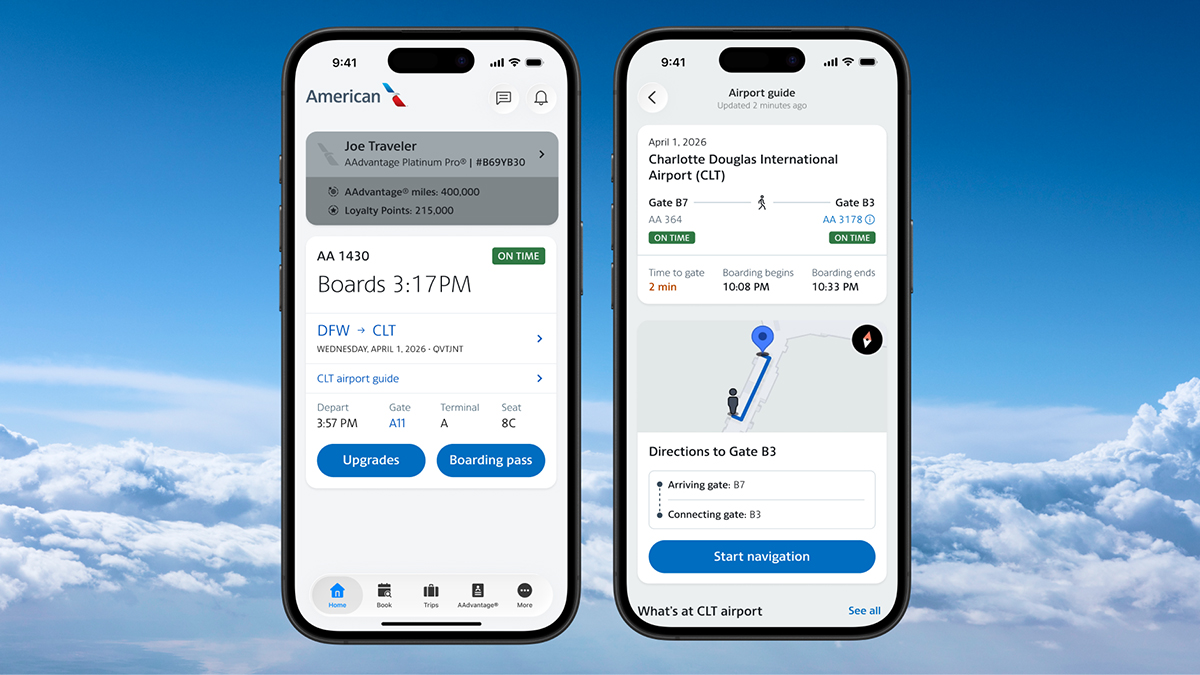
Route, flight number, and status at the top. Segment banners so a multi-leg trip is one object, not a stack. Time strip with a plane icon so departure, arrival, and duration read at a glance. Terminal, gate, and baggage grouped per segment. A primary action that swaps by state, check in, then boarding pass, then waitlist, instead of five buttons competing for a tap.
03 · What got moved
AAdvantage promotion, offers, and general marketing were meaningful business surfaces but they weren't answers to 'what's my next action.' They kept a home elsewhere in the app. On Trip Details, the trip won.
04 · Two audiences, one surface
The screen had to work for a logged-in frequent flyer with status and saved preferences, and for a guest holding a confirmation number. The hierarchy is the same for both; the personalized elements layer in without displacing the operational spine.
Use cases
Two use cases the redesign had to hold up under.
Day-of-travel · Home + airport wayfinding
The Home screen leads with the active trip, flight number, boarding time, route, terminal, gate, and seat. Along with a single primary action (Boarding pass) instead of a wall of buttons. When the traveler taps into the airport guide, it hands off to a connection-aware view: current gate, next gate, walking time, and turn-by-turn directions. Same principle carried across two screens. The trip in front, everything else earning its slot.
Change your trip · Multi-passenger flow
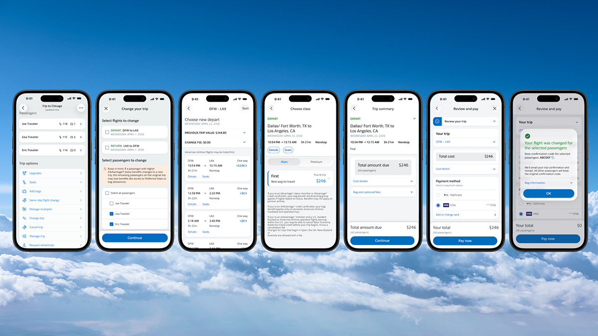
Changing a trip is the highest-stakes flow in the app, multiple passengers, fare rules, status benefits, payment, and a confirmation the traveler has to trust. We designed it as one linear spine: pick passengers, pick a new flight, choose class, review the summary, pay, confirm. Every step is one decision on one screen, with the trip summary always available at the top so the traveler never loses the object they're editing. The AAdvantage and fare-rules context surface as inline explanations, not promotional interruptions.
Results
What actually shipped and what I'd change next.
Trip-first
hierarchy on the primary surface
One action
that swaps by journey state
Guest + member
served by the same layout
American launched the redesigned Trip Details experience as part of the broader 2026 mobile refresh. The outcome I'd point to is the hierarchy: the trip sits at the top of the screen, operational details are grouped where a traveler actually looks for them, and the promotional surfaces that used to compete for attention are elsewhere in the app.
The screen is still largely static across the travel timeline. A traveler three weeks out sees roughly the same layout as someone walking to the gate. If I were shaping the next iteration, I'd invest in context-aware layouts that adapt to where the traveler is in their journey: pre-trip planning, day-of-travel, at the airport, in the air, arriving. Same principle, the trip is the focal point, expressed as several layouts instead of one.
I was one of several designers on this program, and I want to be clear about that. My contribution was the hierarchy on the primary surface, and the argument that pushed marketing and promotional content off it.
Next case study
Watson IoT for a local brewery
IBM · Sugar Creek Brewery