14 / Outerfields · Creative agency · 2025
Landing page for Outerfields, a video and photo creative agency, laid out as a punchy scroll: bold black hero, orange creative-session pitch, purple service marquee, and a final closing frame.
Role
Brand and web designer
Team
Solo
Duration
1 week
Platforms
Marketing site

Problem
Creative agencies live and die by the tone of their own website.
Outerfields needed a landing page loud enough to earn a creative session booking, without turning into a portfolio dump. The brief was a scroll with distinct color moods per section, held together by one strong wordmark.
Process
Color changes with the section, type doesn't.
01 · Black hero, single word
Outerfields set at maximum weight against a black frame with a hero video. No subheadline underneath, the wordmark carries it.
02 · Orange creative-session pitch
The 'schedule a free creative session' block sits in a full-bleed orange section so the CTA is the loudest thing on the page.
03 · Purple service marquee
Illustrations, development, animation, UI/UX, copywriting. Set as a marquee on a lavender field so services scroll past like credits, not a checklist.
04 · Closing frame that stays on brand
The final section returns to the orange with a 'we have arrived, seeking the ambitious' close, so the last thing a visitor reads is a point of view, not a footer.
Use cases
The scroll broken into its four color moods.
01 · Black hero, single wordmark
Outerfields set at maximum weight over a black frame, with the hero video playing directly under the wordmark. No subheadline, the type carries the whole opening.
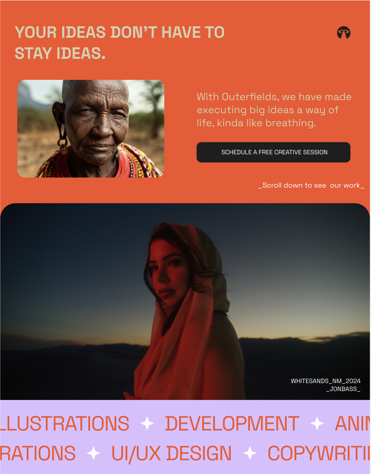
02 · Orange creative-session pitch
A full-bleed orange section makes the 'schedule a free creative session' block the loudest moment on the page, followed by a red-lit editorial portrait that carries the tone into the next scroll.
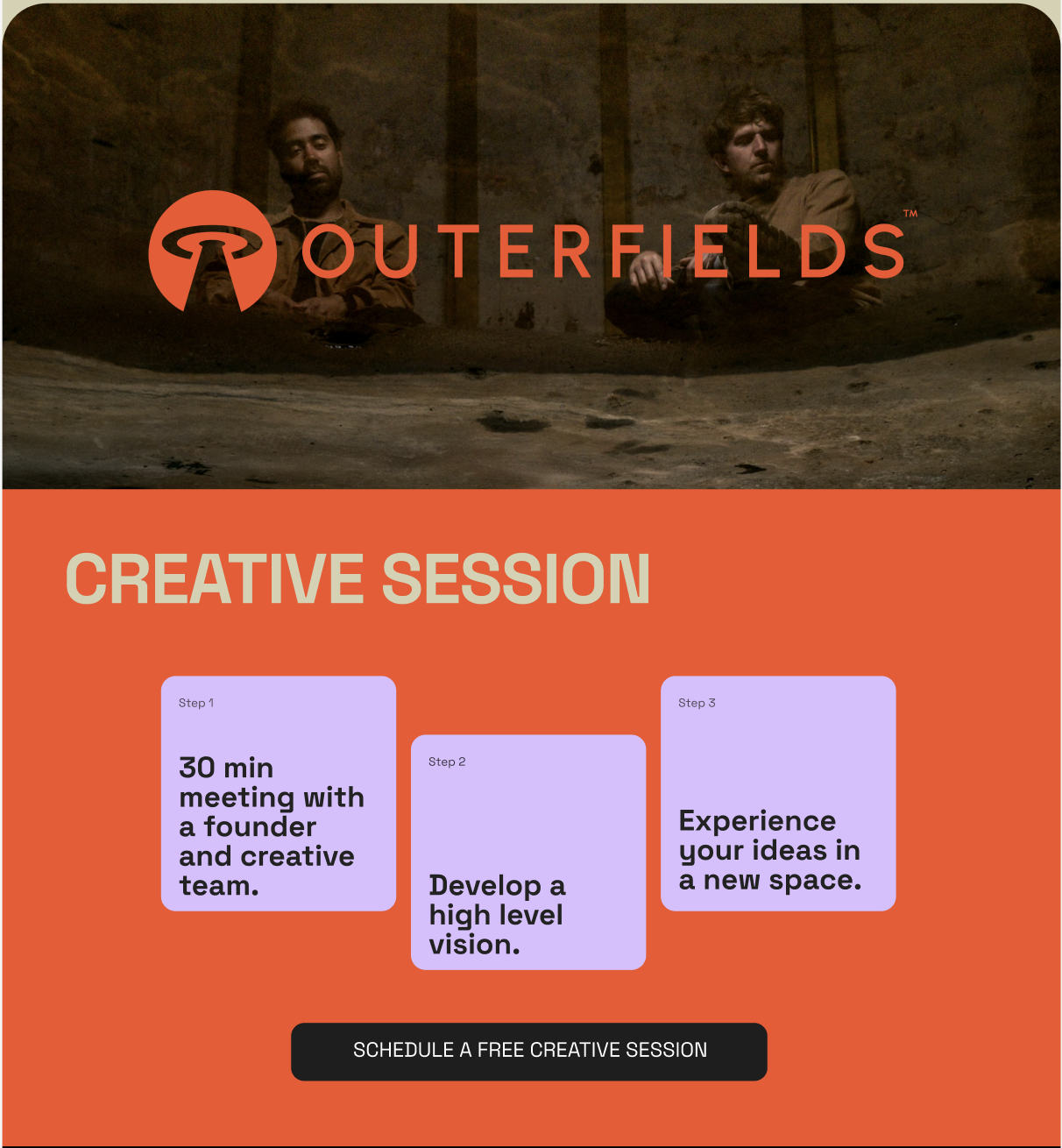
03 · Purple service marquee + testimonial
Illustrations, development, animation, UI/UX, and copywriting scroll past like credits on a lavender field, immediately followed by a client quote so services and proof share one rhythm.
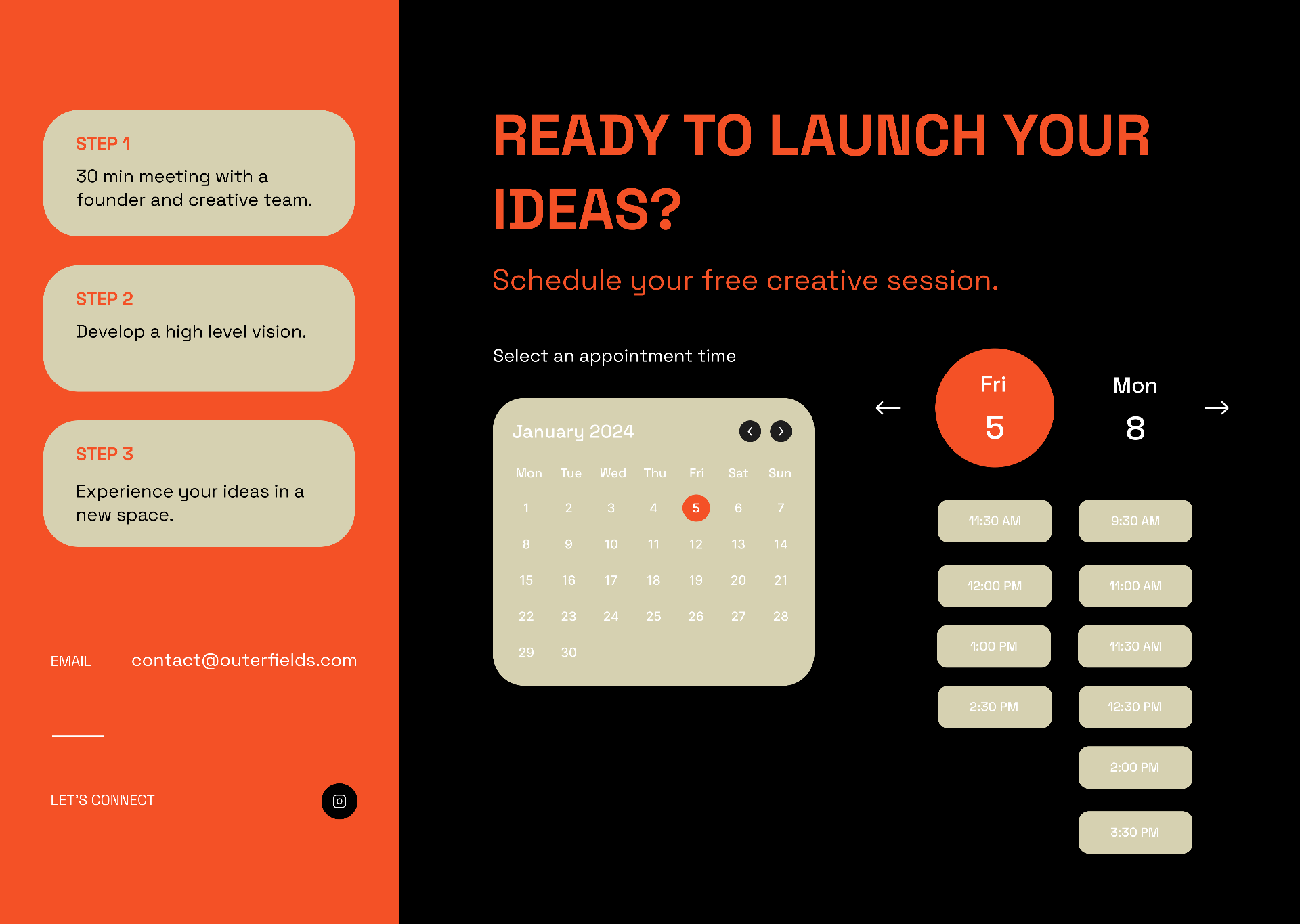
04 · Closing frame that stays on brand
The final scroll returns to the wordmark on a dark editorial still, then closes on a purple 'we have arrived, seeking the ambitious' frame, so the last thing a visitor reads is a point of view.
Results
A site sequenced like a music video, with a booking CTA at the loudest moment.
4 color moods
black, orange, purple, orange
1 wordmark
carries every section
1 CTA
at the loudest frame
The final scroll reads as a piece of the work itself: opinionated composition, confident color, and a single call to action placed exactly where the page is at its loudest.
Next case study
A premier subscription box, designed with the associate in mind
Neiman Marcus · Mobile app