15 / Neiman Marcus · Mobile app · 2021
Partnered with Neiman Marcus to design a stylist-curated subscription box inside the NM app, an ongoing relationship surface rather than another transactional flow.
Role
Design Lead · retail team, partnered with Neiman Marcus
Team
Cross-functional team across UX, design, engineering, and business, in partnership with NM stakeholders
Duration
Multi-phase engagement
Platforms
iOS · NM.com
Problem
A luxury brand under real pressure, looking for a deeper relationship, not another checkout.
Neiman Marcus had filed for Chapter 11 and never fully recovered from prior downturns; COVID made the ground move again. Bob Kupens, then CPTO, framed the brief as: our selling associates create emotional connection every day. How do we invest in technology that lets them do that more?
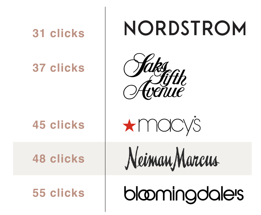
Our task analysis against luxury competitors showed NM's mobile app made customers click more often to build a complete look. The opportunity wasn't a better product page. It was a recurring, relationship-driven touchpoint that borrowed the associate's judgment and put it inside the app.
Process
Anchor the work to one insight from real shoppers: take the guesswork out.
01 · Research & competitive analysis
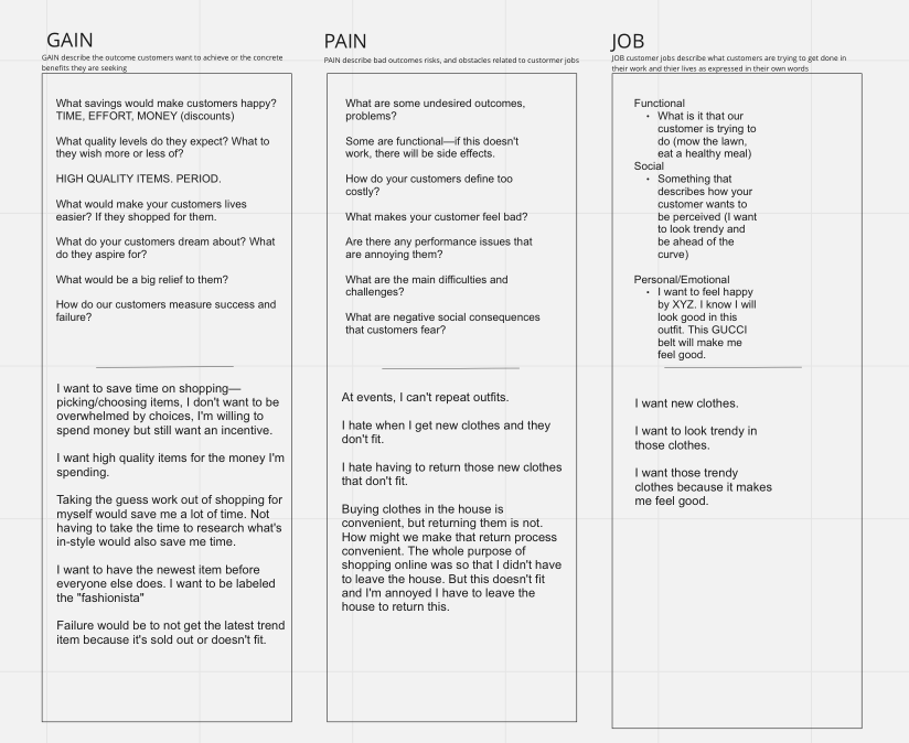
Task-analyzed NM and its direct luxury competitors on the same job: order a complete outfit of a top, pants, and shoes. NM required the most clicks. We paired that with user interviews and sorted gains, pains, and jobs to prioritize what mattered: save time, take the guesswork out, and fix the return experience.
02 · Personas & problem framing
Two personas anchored the work: a decisive, individualistic shopper who wants exclusive access to items in demand, and a shopper who wants to update her style but doesn't know where to start. Same product, two very different reasons to open the app.
03 · The core bet
A subscription box rather than a smarter recommendation engine. The premise: a recurring, stylist-curated touchpoint is worth more than another algorithmic feed, because it invests in the relationship the associate already has with the customer. Every design choice, from onboarding style quiz to new-box message screen, in-box product pages, and returns, reports up to that principle.
04 · Flows, wireframes, style guide
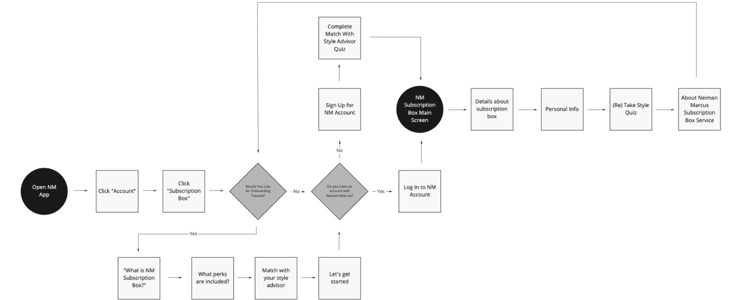
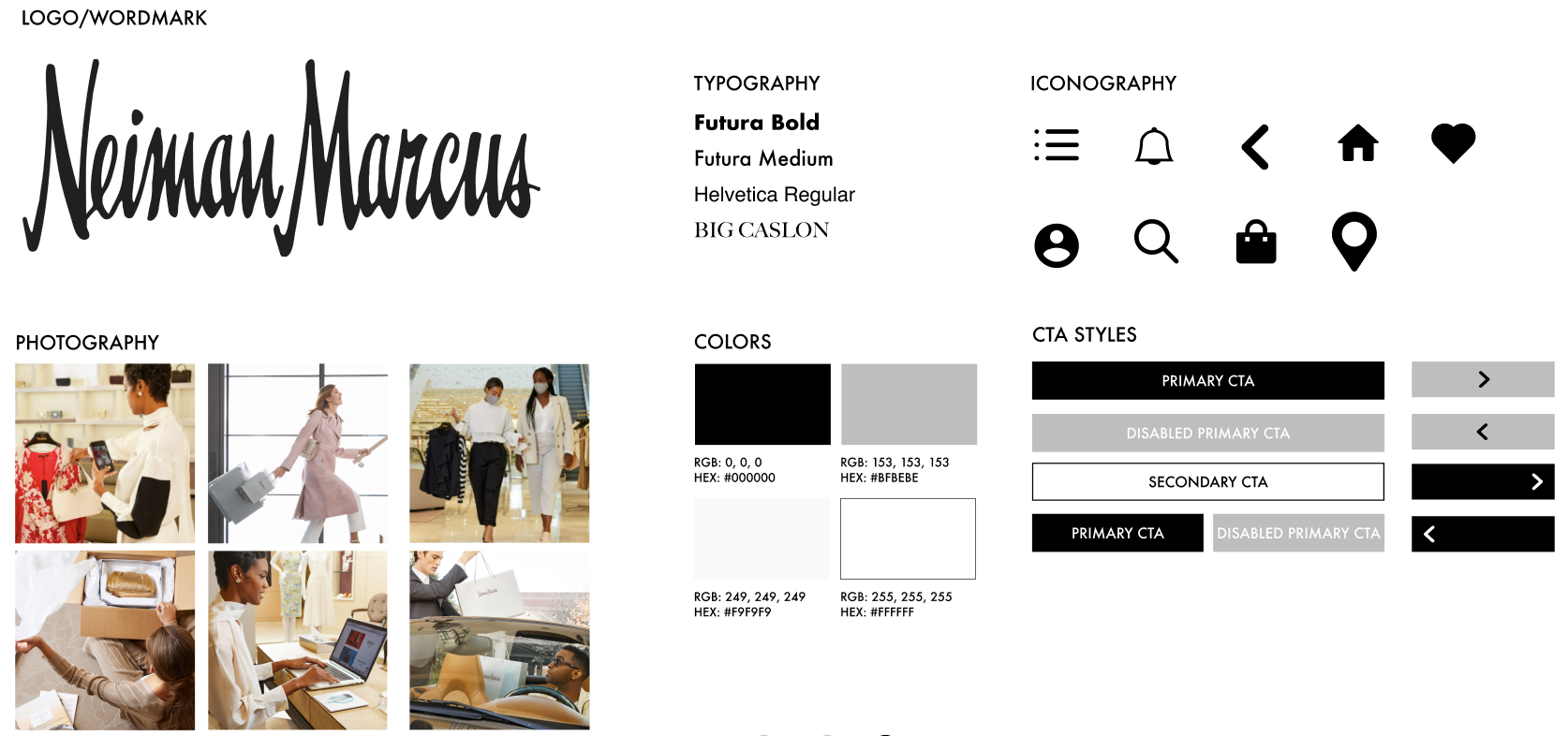
Designed four core flows (onboarding, style quiz, new subscription box, returns), a set of wireframes for account, preferences, box message, and product pages, and a style guide to keep the subscription experience visually consistent with the broader NM brand.
Use cases
Selected artifacts I can share outside the NDA, sequenced the way the work moved.
Competitive analysis · clicks to a complete look
Task analysis across NM and its direct luxury competitors on the same job: order a complete outfit, top, pants, shoes. NM required the most clicks. This chart is where the brief got specific: shorten the distance between a customer and a finished look.
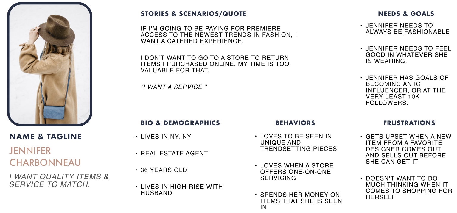
Persona · the decisive, individualistic shopper
Jennifer knows exactly what she wants. Cost isn't the blocker. Access is. The design opportunity is exclusive windows to view and purchase in-demand luxury items before they're gone.
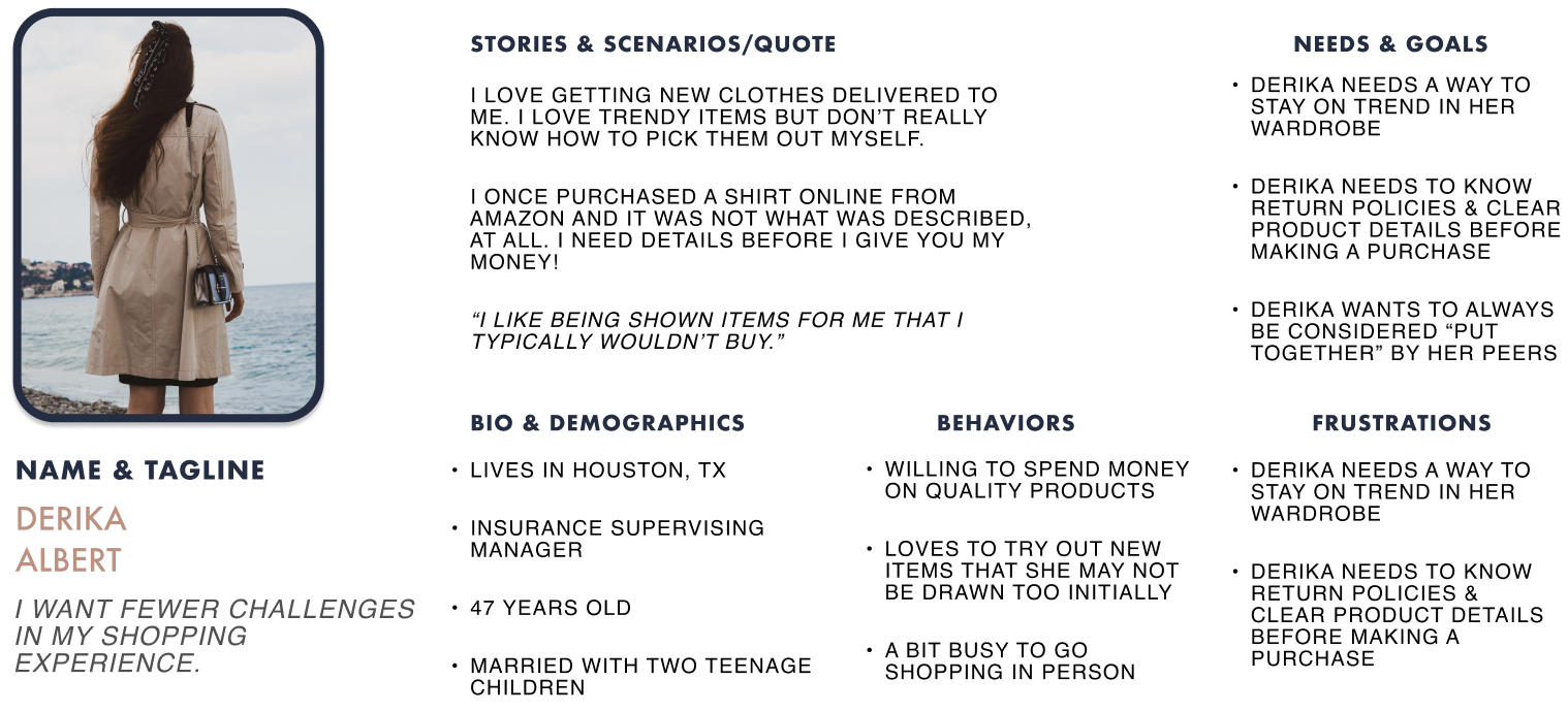
Persona · the style-refresh shopper
Derika wants to update her style but doesn't know where to start. Open to new things, low patience for decision fatigue. The design opportunity is taking guesswork out of the shopping trip entirely.
Gains, pains, and jobs
We sorted interview insights into what shoppers wanted to achieve, what got in the way, and the jobs they described in their own words. Four priorities floated to the top: take the guesswork out, save time, fix returns, and make trendy pieces feel good on. Every downstream flow reports up to one of these.
User flow · onboarding into the subscription
One of the four flows we designed end-to-end (onboarding, style quiz, new box, returns). Onboarding was the highest-stakes surface because it's where a customer decides whether the subscription feels like a stylist or another form. The flow keeps the number of decisions small and front-loads the style quiz so the first box already has a point of view.
Sketches · thinking on paper before pixels
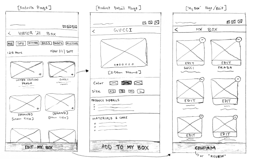
Early sketches for the subscription surface. Paper is where I resolve structural questions, like where the box lives inside the NM app, how the stylist's message reads, and how a product page inside a curated box differs from a normal PDP, before spending time in Figma.
SUS survey · usability score after iteration
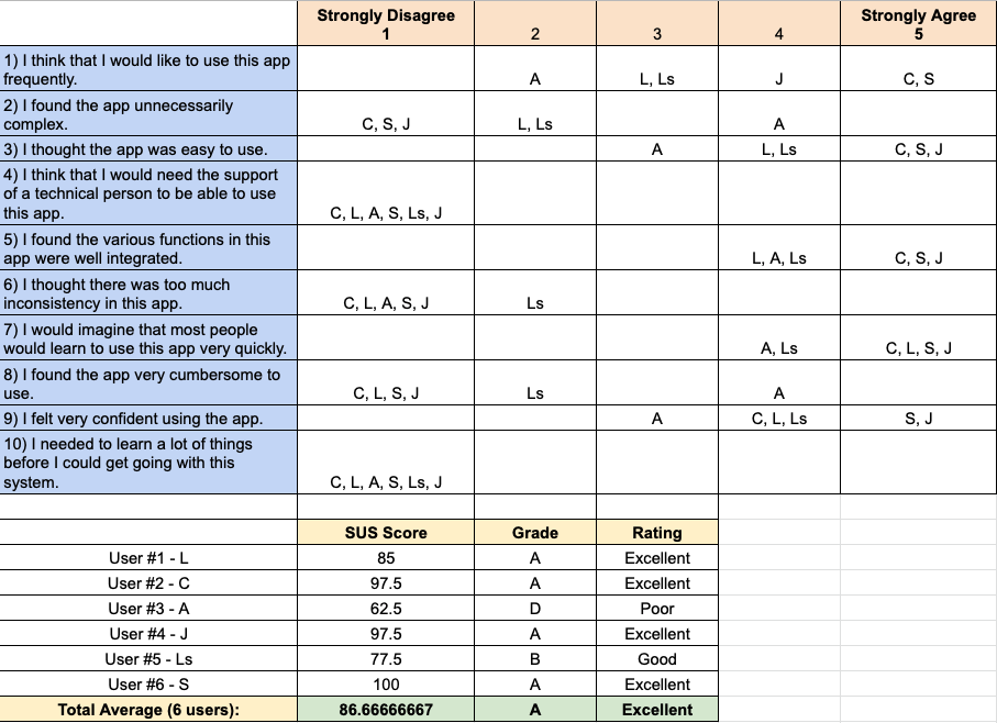
System Usability Scale results from the second round of moderated testing. After iterating on the round-one finding, that the subscription wasn't visible enough on the home page, the design scored 87%, which lands in the 'excellent' band.
Delivery · usability testing recap
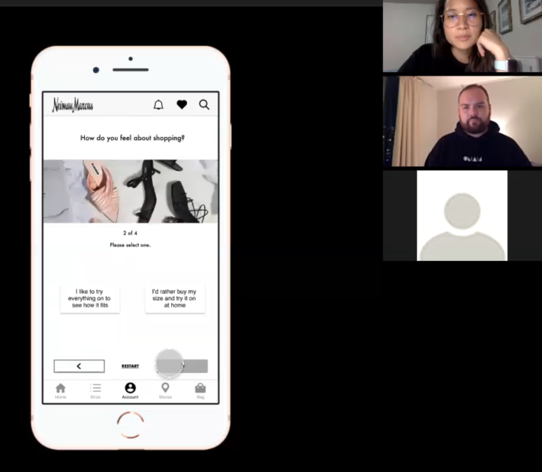
Summary of the moderated usability tests, three users, three flows, nine tasks, roughly 23 minutes per session. Two rounds of testing with iteration in between. It's the artifact I bring when someone asks how the work was validated rather than how it looked.
Style guide · subscription experience
The style guide we produced to keep the subscription surface visually consistent with the broader Neiman Marcus brand: typography, color, imagery treatment, and component usage. The point of a style guide here wasn't novelty; it was making sure a new relationship-driven surface didn't feel like a bolt-on inside a luxury app.
Results
Tested with real users, iterated once, and landed an excellent usability score.
87%
SUS score after iteration (excellent)
9 tasks
moderated across 3 flows
NDA
final visuals disclosed under NDA
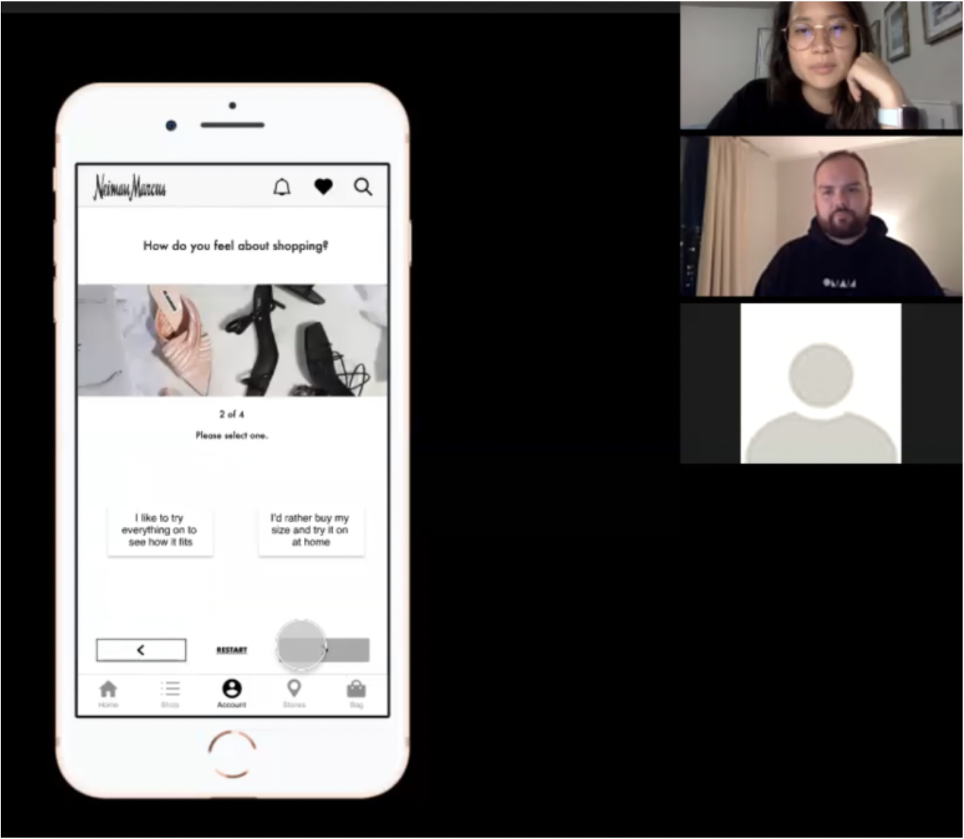
We ran moderated usability tests with users over Zoom, nine tasks across three flows, roughly 23 minutes each. The first round surfaced the most important note: the new subscription service wasn't visible enough on the home page. We iterated, tested again, and the final design earned an 87% SUS score, an excellent rating.
Looking back, the honest next steps I'd own were the ones we scoped out: tighter integration with the InCircle Loyalty program, themed boxes (Black Tie, Maternity, Upcoming Interview), a real naming and marketing test for the feature, and the algorithm that would sit behind the stylist's curation. The design held up; the surrounding system was the next round of work.
Final visuals are under NDA. What I can show is the covers, the delivery testing summary, and the style guide that anchored the subscription experience inside the broader NM brand.
Next case study
A pocket gym, powered by AR
trainAR · Masters capstone