12 / Bankey · Consumer bank · 2025
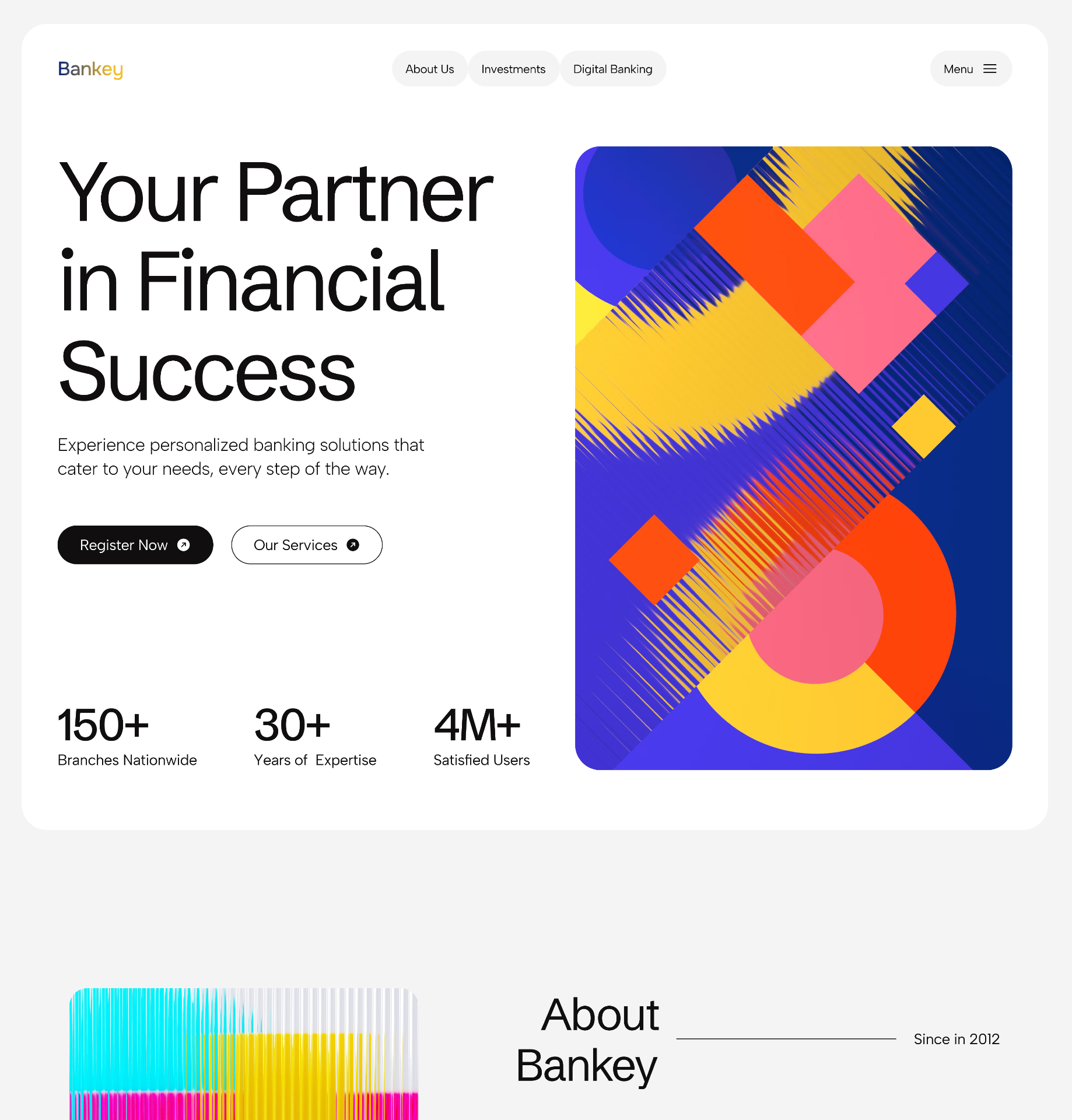
Landing page for Bankey, a consumer bank, pairing a serious value proposition with a hero illustration that behaves more like a museum poster than a fintech asset.
Role
Brand and web designer
Team
Solo
Duration
1 week
Platforms
Marketing site
Problem
Banking sites look like each other, and none of them like something you'd frame.
Bankey wanted a landing page that stood next to the incumbents without borrowing their visual vocabulary: no gradient card, no smiling family, no dashboard mockup on a glass phone.
Process
A serious headline paired with a serious piece of art.
01 · Type on the left, art on the right
Split hero, plain black display sans on the left, a large color-block illustration on the right. Reads as a magazine feature, not a landing page.
02 · Stats where the proof lives
150+ branches, 30+ years, 4M+ users. Three stats sit under the CTAs at the same baseline as the hero image, so the numbers land inside the composition instead of below it.
03 · Menu as a chip, not a bar
Nav lives inside a pill so the top of the page reads as one considered surface instead of a header stapled to a hero.
Results
A financial brand that reads as a point of view, not a compliance form.
1 illustration
does the whole hero
3 stats
grounded to the headline baseline
0 clichés
no glass phone, no gradient card
The result is a page that feels like it belongs in a design annual and still communicates the boring, load-bearing facts a bank's homepage has to communicate.
Next case study
A property site that leads with the product, not the pitch
Build · Real estate platform