19 / Terra · Ceramics retail · 2026
Concept marketing site for Terra, a direct-to-consumer ceramics brand in the West Elm register: editorial typography, shoppable hero, and a category-first storefront built around handmade objects.
Role
Product designer, concept
Team
Solo concept, self-directed
Duration
One-week concept sprint
Platforms
Web · Responsive
Problem
Home-goods brands sell objects, but most sites sell inventory.
Retail sites in the West Elm register lean on grids of thumbnails and a promo banner up top. The category feels interchangeable with any other DTC brand, and the craft of the product, the reason the object costs what it costs, gets flattened into a card.
Terra is a concept brand for a ceramics house that wanted the opposite: the landing page should feel like walking into a gallery-adjacent showroom, where the object is the argument and the shop is one click away, not the whole conversation.
Process
Editorial hero first, then a category storefront that respects the object.
01 · Positioning and register
Anchored on West Elm and Menu as the reference register: warm neutrals, generous whitespace, a serif display voice, and product photography that treats ceramics as sculpture rather than merch.
02 · Shoppable hero
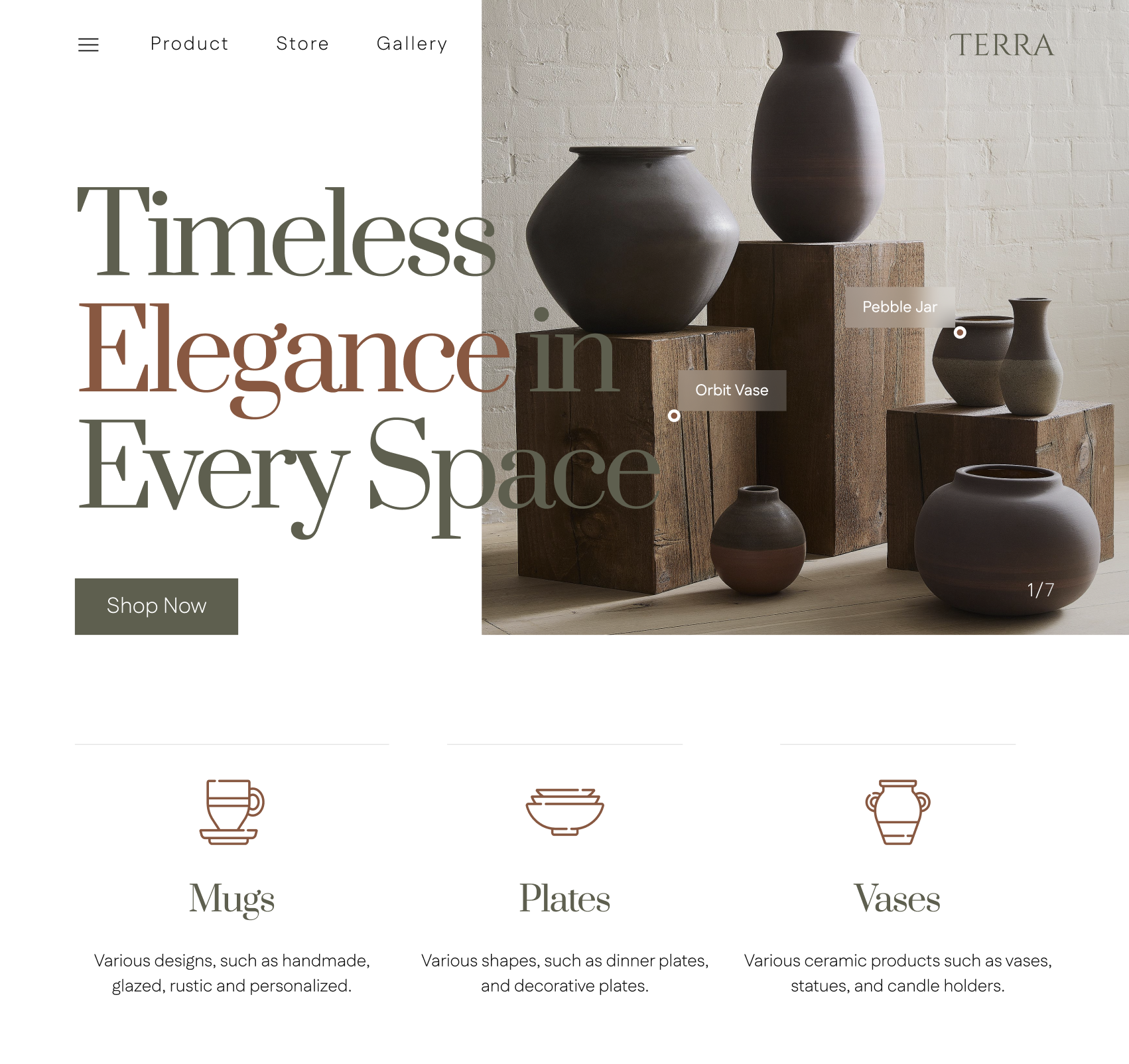
Designed a split hero pairing display typography with a lifestyle still life. Product hotspots (Orbit Vase, Pebble Jar) turn the image into a shoppable surface without stealing focus from the composition.
03 · Category-first storefront
Three primary categories, Mugs, Plates, Vases, sit directly beneath the hero as line-drawn icons with a one-sentence description each. The point is clarity of choice on the first scroll, before any promo or grid.
04 · Type and color system
Set an olive-and-terracotta palette on off-white paper. Display type in a high-contrast serif for headlines, sans-serif for nav and body, with tight tracking on the wordmark to signal a brand, not a store template.
Use cases
Two frames from the concept.
Landing page · hero and category strip
Split hero pairing a serif display headline, Timeless Elegance in Every Space, with a still-life of Terra ceramics on reclaimed wood pedestals. Shoppable hotspots surface Orbit Vase and Pebble Jar on the image itself. Below, three line-drawn icons introduce Mugs, Plates, and Vases as the primary way into the shop.
All Product · category listing page
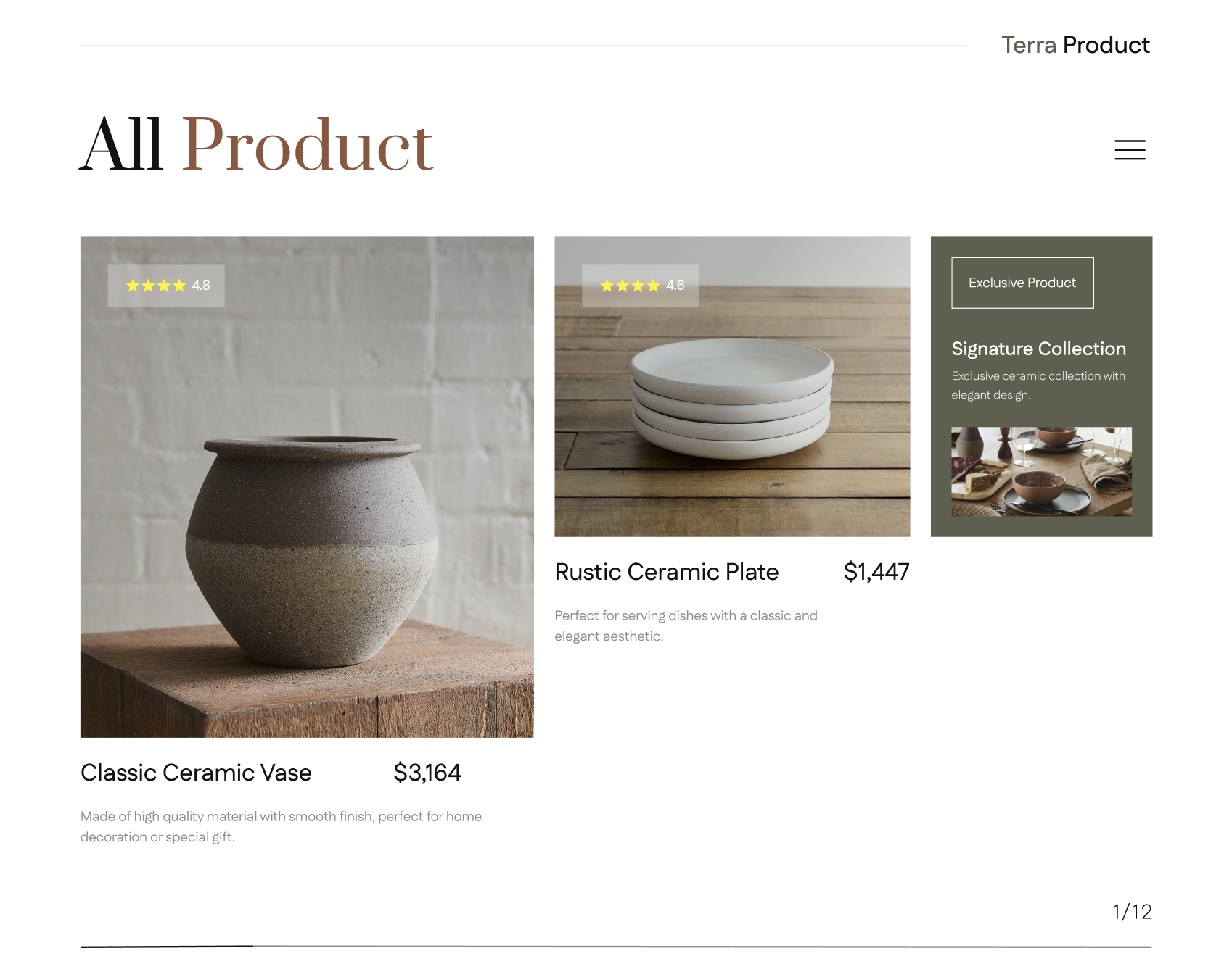
The shop surface carries the same editorial register as the landing page: an oversized serif All Product headline in olive and terracotta, a Terra Product mark top-right, and a bento-style grid that lets one hero product breathe next to a smaller plate card and a Signature Collection promo tile. Ratings sit as glass chips on the imagery, prices align right of the product name, and pagination (1/12) keeps the browsing model quiet at the bottom.
New Collection · editorial feature block
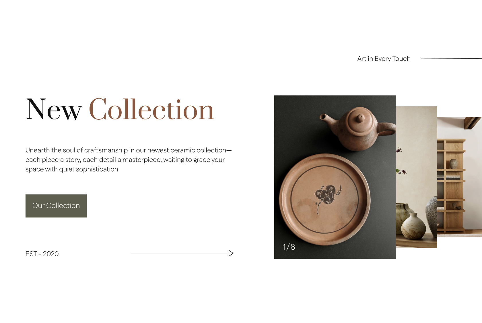
Art in Every Touch section: a split composition with a serif New Collection headline set in black and terracotta, a short craftsmanship paragraph, an olive Our Collection CTA, and an EST — 2020 line paired with a long directional arrow. On the right, a stacked pair of images (top-down teapot and plate on charcoal, plus a warm-toned shelfie) leans in from the edge like a card spread, with a 1/8 counter marking it as a carousel.
Handmade Elegance · shoppable material story
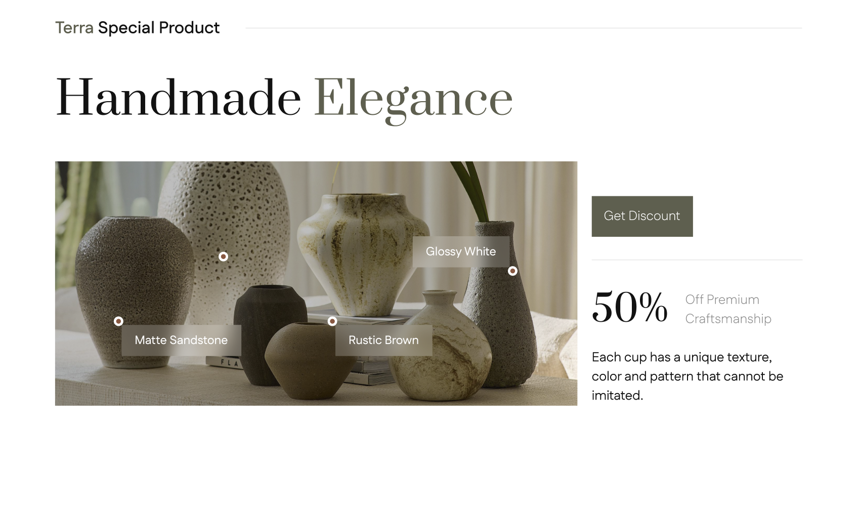
Terra Special Product band framed by a Handmade Elegance headline in mixed black-and-olive serif. A wide lifestyle image of six vases carries three material hotspots (Matte Sandstone, Rustic Brown, Glossy White). To the right, a Get Discount CTA sits above a 50% Off Premium Craftsmanship stat and a one-line note about texture, color, and pattern.
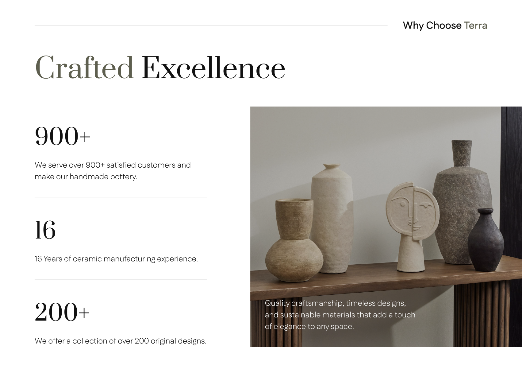
Crafted Excellence · Why Choose Terra
A Why Choose Terra proof section: three left-aligned stats (900+ customers, 16 years of manufacturing, 200+ original designs) stacked as a vertical list with hairline dividers, paired with a single warm still-life of sculptural vases on a fluted wood console. The image carries a short quality-and-sustainability caption in the lower-right corner.
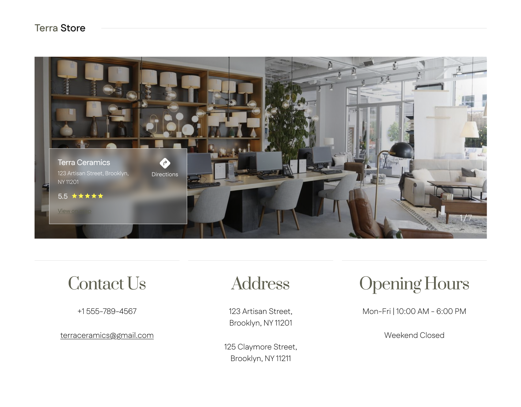
Terra Store · locations and hours
Store surface with a wide showroom photograph anchored by a Google-style location card (Terra Ceramics, 123 Artisan Street, Directions, 5.5 rating). Below, a three-column block sets Contact Us, Address, and Opening Hours in the same olive serif register as the rest of the site: phone and email, two Brooklyn addresses, and Mon–Fri 10–6 with Weekend Closed.
Results
A landing surface that reads as a brand first, and a store second.
1 hero
editorial, shoppable, one composition
3 categories
surfaced above the fold
Concept
self-directed, not a shipped site
The deliverable is a marketing landing page concept: an editorial hero with shoppable hotspots, a three-category storefront strip, and a type and color system that a real Terra site could extend into PLPs and PDPs.
On scope: this is a one-week concept, not a shipped e-commerce build. There is no cart, no checkout, no CMS, and the product photography is directional. It's a point of view on how a small ceramics brand can hold its own next to West Elm without copying the West Elm layout.
Next case study
A landing page for a yoga and pilates studio
SoulStretch · Yoga & Pilates Studio