17 / Camp on the Go · Personal project · 2017
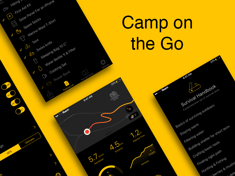
Concept iOS app and Apple Watch extension for campers: organization, campsite discovery, and gear guidance without asking anyone to spend more time staring at their phone.
Role
Designer · personal project
Team
Solo · five in-person interviews and a 49-response survey
Duration
Two weeks
Platforms
iOS concept · Apple Watch extension
Problem
Camping was popular; keeping any of it organized was not.
Technology often takes the rap for our couch-potato lifestyle, but plenty of people still want to get outside. The survey I ran picked up 49 responses in two days and five deeper in-person interviews. The consistent problem underneath all of it was organization: campsites, gear, and the walking / activity around a trip lived as separate mental loads.
The brief I set for myself was small and honest: a two-week concept for an app that helps first-time campers and long-time adventurers keep the trip organized without becoming another reason to look at a screen.
Process
Design for where the app gets used, not for the feature list.
01 · Research and problem framing
A survey (49 responses) plus five in-person interviews covering camping habits, e-commerce preferences, and 'the perfect app.' Three user goals fell out: keep it organized, learn about campsites and parks, and learn what gear you need for the season.
02 · The core bet
Day and night modes in the app, and an Apple Watch extension for anything the phone shouldn't own. Neither was cosmetic. Bright blue light disrupts circadian rhythm at a campsite, and a watch is better than a phone for anything you'd otherwise pull out mid-trail. iPhone as alternate reality; Apple Watch as augmented reality.
03 · Four prototype iterations
Sketched on paper, moved to Sketch, walked away, sketched again, four versions across the two weeks. Each round moved through moderated feedback sessions with real users; some notes were flattering, some sent me back to the drawing board.
04 · What made it into the concept
Nearest campsites, recommended gear with direct shopping, a walking-steps tracker, and a blog / forum surface, all inside one app with day and night modes, plus a companion Apple Watch flow scoped to glanceable moments on the trail.
Use cases
Two artifacts from the two-week concept.
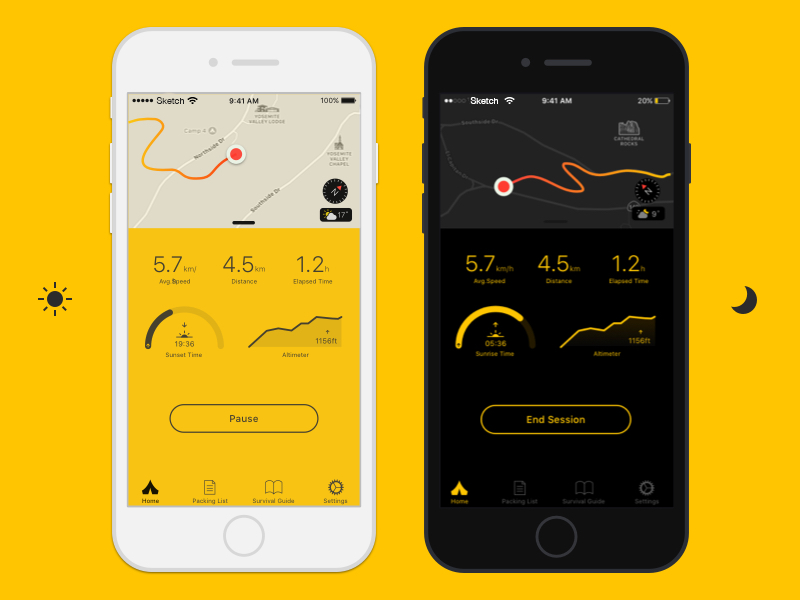
Day and night mode · same surface, different context
The app carries a day and night mode for viewing preferences. The reason is context, not novelty. Bright blue light throws off circadian rhythm, and a camper opening the app at 10pm at a campsite is not the same user as one opening it at noon on the way there. Same product, adapted to the moment.
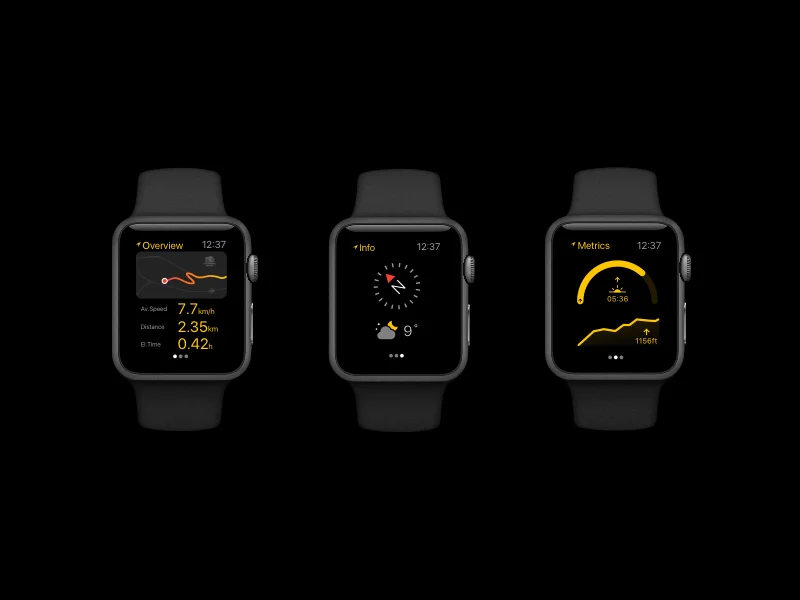
Journey on your wrist · Apple Watch extension
iPhone is alternate reality; Apple Watch is augmented reality. The Watch extension is scoped to glanceable moments on the trail: steps, current campsite, next checkpoint. Instead of trying to shrink the whole phone app onto a wrist. The goal isn't more screen time; it's fewer reasons to stop and look at a phone.
Results
A clickable concept, an honest look back, and a scope I'd own.
4 rounds
of prototype iteration in two weeks
49 + 5
survey responses and interviews
Concept
iPhone + Apple Watch, not production
The output was a clickable iPhone prototype in Sketch: onboarding, campsite discovery, seasonally-aware gear recommendations, walking tracker, and community forum, with day and night modes throughout, and an Apple Watch extension concept for the moments a phone shouldn't own.
Some context on the year and the scope. This was 2017, early in my career, and it stayed a concept. The community surface would need real moderation, the gear recommendations were static rather than personalized, and the Watch flow is a concept, not an ARKit-era build. What holds up is the framing: design for a campsite, and let the wrist do what the wrist is good at.
If I picked the work up again, I'd validate with real campsites and hikers instead of a conference-room prototype, and I'd build the personalization as a service someone runs rather than a screen someone draws.
Next case study
First design internship, under NDA
7-Eleven · Global HQ